Sign in

Libre University uses your GitHub account. Signing in is only needed to sit a final test, so the score is kept on your profile.

Statistics

Estimate, test and interpret honestly: sampling, likelihood, confidence and significance, regression, and the ways published numbers mislead.

From probability to inference

Probability answers questions of the form "given this coin is fair, how often will 100 tosses give at least 60 heads", and the answer is a number computed from the model. Statistics asks the question that actually comes up: someone tossed a coin 100 times, got 60 heads, and wants to know whether the coin is fair. This lesson sets up that reversal carefully, because almost every mistake later in the subject is a failure to keep the two directions apart.

The direction of the arrow

In a probability problem the model is given and the data is uncertain. A fair die has a known distribution, and the question is what a batch of rolls will look like. Every quantity in the model, the p of a binomial, the λ of a Poisson, the μ and σ of a normal, is handed over at the start, and the work is deduction: a chain of correct steps from the model to a probability.

In a statistical problem the data is given and the model is uncertain. Someone hands over 100 tosses with 60 heads, or 130 body temperatures, or the yields from 24 plots of barley, and the question is what produced them. Nothing about the mechanism was supplied. The arrow points backwards, from the outcome to the cause, and reversing an arrow is exactly the operation that probability warned about: many models can produce the same data, so the data cannot single one out.

That is not a technicality to be engineered away. It is the permanent situation. A fair coin gives at least 60 heads in 100 tosses about 2.8 per cent of the time, which is uncommon but hardly impossible, so 60 heads is genuinely compatible with fairness and also genuinely compatible with a coin biased to 0.6. No amount of cleverness extracts certainty from that. What statistics does instead is quantify how well each model accounts for what was seen, and attach to every answer a statement about how often that kind of answer is wrong.

The discipline built on that is younger than it looks. Probability was mature by 1800; the machinery of this course was assembled between about 1890 and 1935 by a small number of people working on real problems, Karl Pearson on biological measurement, William Gosset on brewing, Ronald Fisher on agricultural field trials, Jerzy Neyman and Egon Pearson on the logic of decisions. The dates matter because the concepts still carry the shape of the problems they were invented for.

Population, sample, parameter, statistic

Four words do most of the work, and using them loosely is the source of a great deal of confusion.

The population is every unit the question is about. It may be finite and countable, such as the 47.6 million people on the United Kingdom parliamentary electoral register in December 2019, or hypothetical and unbounded, such as every measurement that a given instrument could produce. The sample is the subset actually measured. The parameter is a number describing the population, such as its mean μ or its proportion p, and it is fixed, unknown and usually unknowable. The statistic is a number computed from the sample, such as the sample mean x or the sample proportion pˆ, and it is known exactly, because it was calculated, and it is different for every sample.

The notation follows the split without exception. Greek letters for parameters, Latin letters or hatted symbols for statistics. When a formula in this course mixes them, that is the point: it is a bridge between the two worlds, and finding those bridges is what the next few lessons do.

The word "average" wrecks this distinction by covering both, which is why it is avoided from here on. The population mean μ and the sample mean x are not two names for one thing. One is a fact about the world that no one has access to; the other is an arithmetic result that will change tomorrow if a different sample is drawn.

The estimate is itself a random variable

Here is the pivot on which the whole subject turns. Because the sample was chosen by a random mechanism, any number computed from it is a function of random quantities, which makes it a random variable in exactly the sense of the probability course. It has a distribution, a mean and a variance, and those can be worked out from the model even though the parameter cannot.

Take a die as the population, since its parameters are known and the reasoning can be checked against them. The population mean is μ=3.5 and the population variance is

σ2=1+4+9+16+25+366-3.52=916-12.25=2.9167

so σ=1.7078. Now roll it ten times and record the mean. A real run of ten gave 4, 2, 6, 3, 1, 5, 5, 2, 4, 6, summing to 38, so x=3.8. That is not 3.5, and nothing has gone wrong: the estimate missed by 0.3 for no reason other than which faces came up.

Roll another ten and x will be something else. The set of values x takes across all possible samples, with their probabilities, is called the sampling distribution of x, and it is the single most important object in the subject. It exists whether or not anyone computes it, and it is what makes a statement about one sample into a statement about the world.

Example. For the mean of ten rolls, what are the mean and standard deviation of the sampling distribution?

The rolls are independent with mean 3.5 and variance 2.9167 each. Expectation is linear, so E[X]=3.5 exactly. Variances of independent variables add, and dividing by ten divides the variance by 102, so Var(X)=2.9167/10=0.29167 and the standard deviation is 0.29167=0.5401.

Now you. What are the mean and standard deviation of the sampling distribution of X for forty rolls?

Answer

The mean is still 3.5. The standard deviation is 2.9167/40=0.2700, exactly half the value for ten rolls, because forty is four times ten and the square root of four is two.

How far off is one sample likely to be

That last calculation is already an answer to the practical question, and it is worth pressing on it. The sampling distribution of the mean of ten rolls can be computed exactly, by convolving the die distribution with itself ten times, and it gives

P(3.0X4.0)=0.6870

so a single sample of ten misses the truth by more than half a point about 31 per cent of the time. For forty rolls the same calculation gives 0.9426, and for the estimate to be reliably close, the sample has to be large.

Notice the shape of the improvement. Quadrupling the sample from ten to forty halved the standard deviation, because the standard deviation of the mean is σ/n and the square root is doing the damage. Halving an error costs four times the data; cutting it to a tenth costs a hundred times. That single fact governs the cost of every survey, trial and experiment in this course, and it is the reason large studies are rare.

It also explains something that sounds wrong when first heard. A national poll of 1000 people reports a margin of error of about 3 percentage points, and the same 1000 people give the same 3 points whether the country has 5 million voters or 300 million. The finite population correction that accounts for the population's size is (N-n)/(N-1), which for N=60 million and n=1000 equals 0.99999, a correction in the fifth decimal place. What matters is the size of the sample, not the fraction of the population it represents.

Example. In a survey of 1000 people, 520 say they will vote yes. The standard deviation of pˆ is p(1-p)/n. Estimate it, and give the usual two-standard-error range.

Using pˆ=0.52 in place of the unknown p, the standard error is 0.52×0.48/1000=0.0158. Multiplying by 1.96 gives 0.031, so the familiar "plus or minus 3 points". The later lessons make the logic of that interval precise; the arithmetic is already available.

Now you. How large a sample is needed to bring 1.96p(1-p)/n down to 1 percentage point, in the worst case p=0.5?

Answer

Set 1.960.25/n=0.01, so n=1.962×0.25/0.0001=9604. Ten times the precision of a 96-person survey costs a hundred times the people.

Two kinds of error, and only one of them shrinks

The die example had one source of error: which faces happened to come up. That is sampling error, it is unavoidable, it is quantifiable, and it shrinks as 1/n. Almost all of the mathematics in this course is about sampling error, for the simple reason that it is the part that can be described by a formula.

The other kind is bias, meaning any mechanism that pushes the estimate away from the truth in a consistent direction. A thermometer reading 0.4 degrees high, a survey that reaches only people who answer the telephone at two in the afternoon, a study that measures only the patients who came back for a follow-up. Bias does not shrink with n. Collecting ten thousand readings from the same miscalibrated thermometer produces a very precise estimate of the wrong number, and the standard error shown alongside it, being computed from the spread of the readings, will look reassuringly small.

That asymmetry is the most practically important sentence in this lesson. The quantity a statistical formula reports is the sampling error, and it says nothing whatever about the bias. A published figure of "43 per cent, plus or minus 3 points" is a claim about the arithmetic of random sampling and not a claim that the true value is near 43. It is near 43 only if the sample was drawn in a way that gives everyone a known chance of appearing, which is the subject of the sampling lesson later on and the reason that lesson exists.

Example. A bathroom scale reads 0.8 kg heavy. A person weighs themselves 100 times, and the readings vary by about 0.3 kg from the day-to-day noise. What does the standard error of the mean reading say about the accuracy of the result?

The standard error is 0.3/100=0.03 kg, so the mean of the readings pins down what the scale says to within a few tens of grams. What the scale says is 0.8 kg away from the truth, and every one of the 100 readings is 0.8 kg off in the same direction, so the reported precision describes the noise and completely misses the error.

Now you. The person takes 10000 readings instead. What is the standard error, and how far is the mean from the true weight?

Answer

The standard error falls to 0.3/10000=0.003 kg, and the mean is still 0.8 kg too high. More data buys precision and buys nothing at all against bias.

What a statistical answer is allowed to claim

Given that the arrow cannot be reversed with certainty, what exactly is being sold? Three kinds of claim, and each is more modest than the sentence people usually take away from it.

An estimate is a single number offered as the best available guess of a parameter, together with a standard error saying how much it would move if the study were repeated. A confidence interval is a range constructed by a procedure that captures the true parameter in a stated proportion of repetitions, 95 per cent by convention. A test reports how unusual the data would be if a specified model were true. All three are statements about the behaviour of a procedure over repeated use, not statements about the certainty of one particular conclusion.

That is a genuine limitation and it is worth stating plainly rather than glossing. Statistics does not tell you whether this coin is fair. It tells you that a rule you might adopt for deciding about coins gets it wrong at most five per cent of the time when the coin is in fact fair, and you get to choose the rule. A reader who wants a probability attached to the hypothesis itself is asking a Bayesian question, and the probability course showed that answering it requires a prior. The frequentist machinery developed here avoids the prior by changing the question, and knowing exactly which question is being answered is what separates using these tools from being used by them.

What is coming

The plan follows directly from this lesson. A sample has to be reduced to a few numbers before anything can be said about it, and the choice of those numbers is not innocent, so that is next. Then comes the collection itself, since a statistic computed from a bad sample is arithmetic without meaning. After that the sampling distribution can be derived properly rather than sketched, which unlocks estimation, intervals, tests, comparisons and the fitting of lines.

The last lessons return to the point made in passing above. Everything in the middle of the course is correct, and correct is not sufficient, because the interesting failures happen at the joins: in how the data was gathered, in which analysis was chosen after seeing it, and in what the resulting number was made to say.
Describing a batch of numbers

A sample of a thousand measurements cannot be thought about all at once, so the first act of any analysis is to replace it with a few numbers. The previous lesson called those numbers statistics and said they were random; this one asks which ones to compute, and shows that the choice is a substantive decision rather than a formality.

What a summary is for

There are two different jobs on offer. One is description: saying compactly what this batch looks like, with no claim about anything beyond it. The other is estimation: using the batch to guess a property of the population it came from. The same arithmetic serves both, which is why they get muddled, but the standards differ. A description is right or wrong about the data in front of it, while an estimate can be an accurate description and still a bad guess.

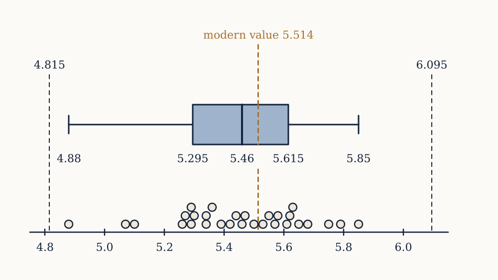
The running example is real and small enough to check by hand. In 1798 Henry Cavendish published 29 determinations of the mean density of the Earth, relative to water, from the tiny attraction between lead spheres on a torsion balance. Sorted, they are

4.88, 5.07, 5.10, 5.26, 5.27, 5.29, 5.29, 5.30, 5.34, 5.34, 5.36, 5.39, 5.42, 5.44, 5.46, 5.47, 5.50, 5.53, 5.55, 5.57, 5.58, 5.61, 5.62, 5.63, 5.65, 5.68, 5.75, 5.79, 5.85

The modern value is 5.514, so this batch is a rare case where the truth is known and the quality of each summary can be judged against it.

Where the middle is

The sample mean is the total shared out equally,

x=1ni=1nxi

which for Cavendish's 29 values is 5.448. The median is the middle value once sorted, the fifteenth here, which is 5.46. They differ by 0.012, and the reason is the first value in the list.

Each of the two is the answer to a precise optimisation, which is the honest way to see what distinguishes them. Ask which single number c makes the total squared error (xi-c)2 as small as possible. Differentiate: ddc(xi-c)2=-2(xi-c), which vanishes when xi=nc, so c=x, and the second derivative 2n is positive so it is a minimum. The mean is the least-squares centre.

Now ask which c minimises the total absolute error |xi-c|. Each term contributes a slope of -1 while c is below xi and +1 while it is above, so the total slope is (number of points below c) minus (number above). That is zero exactly when the two counts balance, which is the definition of the median. The median is the least-absolute-error centre.

The difference between squaring an error and not squaring it is the whole story. Squaring makes a point ten times as far away count a hundred times as much, so the mean is dragged towards any distant value, while the median counts only which side each point falls on and so ignores how far out it is.

Example. Seven employees earn 21, 23, 24, 26, 28, 30 and 210 thousand pounds. Find the mean and the median, and say which better describes what a typical employee earns.

The total is 362, so x=362/7=51.7 thousand. The median is the fourth of the seven sorted values, 26 thousand. Six of the seven employees earn less than the mean, so as a description of a typical wage the mean is useless here and the median is exact. As a description of the payroll the mean is the right one: it is the total divided by the headcount, and the total is what the employer pays.

Now you. The employee on 210 leaves and is not replaced. Find the new mean and median.

Answer

The remaining six total 152, so the mean is 152/6=25.3 thousand, a fall of 26.4. The median becomes the average of the third and fourth values, (24+26)/2=25, a fall of 1. One departure moved the mean by more than a quarter of its value and the median by four per cent.

Quantiles and the five-number summary

The median generalises. The quantile at level q is a value with a fraction q of the data at or below it, so the median is the quantile at 0.5, the quartiles are at 0.25 and 0.75, and percentiles are quantiles expressed in hundredths. For a finite batch the definition needs a tie-breaking convention when qn is not a whole number, and software packages use at least nine different ones, so quartiles quoted to three decimals from different tools will not always agree. The convention used here is the simplest: the median of the values below the median, and the median of the values above it.

For Cavendish that gives Q1=5.295 and Q3=5.615, so the middle half of his measurements spans 0.32. Together with the smallest value 4.88, the median 5.46 and the largest 5.85, those five numbers are the five-number summary, and they are what a boxplot draws.

The distance Q3-Q1 is the interquartile range, and it is the natural partner of the median: both depend only on the ordering of the data, and neither notices how extreme an extreme value is. A common convention flags as outliers any point more than 1.5×IQR beyond a quartile. Here that means below 5.295-0.48=4.815 or above 5.615+0.48=6.095, and Cavendish's suspicious 4.88 falls inside the lower fence and is not flagged. The rule is a convention, chosen because it flags about 0.7 per cent of a normal sample, and it has no authority to declare a measurement wrong.

Example. For the Cavendish batch, what fraction of the values lie within the interquartile range, and what does that say about the shape?

By construction about half do, which is what makes the IQR comparable across batches. What is informative is the position of the median inside it: 5.46-5.295=0.165 below and 5.615-5.46=0.155 above, almost symmetric, so the middle of this batch is not skewed even though the lowest value sits well out.

Now you. Using the same 1.5×IQR convention, how far below Q1 would a measurement have to fall to be flagged?

Answer

Below 5.295-1.5(0.32)=4.815. Cavendish's 4.88 misses the fence by 0.065, which is why a summary should never be the only thing looked at.

Measuring spread

Location without spread is nearly useless: two batches with the same centre can be entirely different. The natural measure of spread starts from the deviations xi-x, whose sum is always exactly zero by the least-squares property above, so they must be squared before adding. The sample variance is

s2=1n-1i=1n(xi-x)2

and the sample standard deviation s is its square root, which restores the original units. For Cavendish, s=0.221.

The divisor is n-1 rather than n, and the reason is genuinely not obvious. The short version is that the deviations are taken from x rather than from the true mean, and x sits by construction in the middle of this particular sample, so the squared deviations come out systematically too small. Dividing by n-1 corrects that exactly. The lesson on estimators proves it; for now, treat n-1 as the version to use whenever the batch is a sample from something larger, which is essentially always.

The standard deviation has the same units as the data and scales the same way. Adding a constant to every value shifts the mean by that constant and leaves s untouched, since it shifts every deviation equally by zero. Multiplying every value by a multiplies the mean by a and the standard deviation by |a|, so converting a batch of prices from pounds to pence multiplies both by 100. That is why a standard deviation is meaningless without its units, and why the dimensionless ratio s/x, the coefficient of variation, is the right thing to quote when comparing spreads across quantities of different sizes.

Example. Find the mean, variance and standard deviation of 2, 4, 4, 4, 5, 5, 7, 9.

The total is 40 and n=8, so x=5. The deviations are -3,-1,-1,-1,0,0,2,4, whose squares total 9+1+1+1+0+0+4+16=32. So s2=32/7=4.571 and s=2.138. Dividing by 8 instead would give exactly 4 and 2, which is why this batch appears in textbooks, and why it quietly teaches the wrong divisor.

Now you. Every value is doubled, giving 4, 8, 8, 8, 10, 10, 14, 18. What are the new variance and standard deviation?

Answer

Doubling multiplies the standard deviation by 2 and the variance by 4, so s2=18.29 and s=4.276. No fresh arithmetic is needed.

Resistance against efficiency

There is now a mean and a median, a standard deviation and an interquartile range, and a standing question of which to use. The trade is between resistance and efficiency, and it is real in both directions.

An estimator is resistant if a small number of arbitrarily bad values cannot move it far. The median's breakdown point is 50 per cent: half the data can be replaced by nonsense before the median leaves the range of the good half. The mean's breakdown point is 1/n, since one value taken to infinity takes the mean with it. The employee example showed a breakdown point of one seventh in action. Removing Cavendish's 4.88 moves the mean from 5.448 to 5.468 and the median from 5.46 to 5.465, a factor of four difference in sensitivity from a single point out of 29.

Resistance is not free. If the data really is a clean sample from a normal population, the median throws away information: its sampling variance is π/21.57 times that of the mean for large n, so using the median costs about 36 per cent of the sample. A study of 1000 people analysed by medians has the precision of one of 640 analysed by means, which is an expensive kind of caution.

The working rule that follows is not a formula but a habit. Use the mean and standard deviation when the batch is roughly symmetric and free of stragglers, since they are more precise and everything downstream in this course is built on them. Use the median and interquartile range when the batch is skewed or contaminated, and say which was used. Quoting both, and noting when they disagree, tells the reader more than either alone: the gap between them is itself a measurement of skew.

Shape, and why the mean and median part company

When the mean sits well above the median, a long right tail is pulling it. United States household income in 2022 had a median of 74,580 dollars and a mean of 105,555 dollars, a ratio of 1.42, and the mechanism is the same as in the payroll example on a national scale. Reporting the mean is not wrong, but it answers "how much income is there per household", not "what does a household in the middle have", and the two questions have politically different answers.

Skew is measured formally by the third standardised moment, 1n(xi-x)3/s3, zero for a symmetric batch, positive for a right tail and negative for a left one. Cubing makes it even more sensitive to single extreme points than the variance is, so it is worth knowing and worth distrusting.

The more useful move with strongly right-skewed data is to take logarithms first. If the values are generated multiplicatively, incomes, city populations, particle sizes, then their logarithms are roughly symmetric and everything in this course applies to those instead. The mean of the logarithms exponentiates back to the geometric mean, the correct centre for quantities that compound.

What summaries cannot see

In 1973 Francis Anscombe published four datasets of eleven points each, constructed so that a great deal of standard arithmetic cannot tell them apart. All four have x=9.00, y=7.50, sample variance of x equal to 11.00, sample variance of y equal to 4.13, correlation 0.816, and least squares line y=3.00+0.500x, all agreeing to the printed precision.

The first is a genuine noisy linear relationship, which is what everyone pictures. The second is a perfect parabola, with no straight-line relationship at all, that the fitted line describes catastrophically. The third is eleven points in an exact straight line of different slope plus a single far-off point that drags the fit to match the first two. The fourth has ten points sharing one x value and a single point elsewhere, so the entire slope is determined by one observation, and deleting it leaves the slope undefined.

The lesson usually drawn is "plot the data", which is correct and slightly too comfortable. The sharper version is that these summaries are answers to specific questions, and a batch is not obliged to be the kind of thing those questions are about. The mean of a bimodal batch describes a value that may occur in neither mode. A correlation summarises linear association and returns something meaningless when the relationship is not linear. The failure is not in the arithmetic, which is exact, but in the assumption that the arithmetic was worth doing.

Every number so far has described the batch in hand. Whether any of them says anything about the world depends entirely on how the batch was collected, which is the next lesson, and no amount of care with quartiles repairs a sample chosen badly.

Where the data comes from

Every formula in the rest of this course begins with the phrase "let X1,dots,Xn be independent draws from the population", and that phrase is an assumption about how the data was collected rather than a property of the numbers. This lesson is about earning it, and about the two ways studies routinely fail to.

The frame, and the gap in front of it

Three things are easy to run together. The target population is who the question is about: adults in France, patients with a particular diagnosis, screws produced by a machine this week. The sampling frame is the list actually available to sample from: a register, a customer database, a set of telephone numbers, the crate on the bench. The sample is what comes back.

The frame is never the population. A telephone frame omits people without telephones and includes numbers that no longer belong to anyone. A patient register omits those who never sought care. The difference is coverage error, and it is a property of the list, so it is fixed before a single observation is taken and cannot be detected from the data afterwards. A perfectly executed random sample from the wrong frame is a perfectly executed measurement of the wrong population.

Naming the frame explicitly is therefore the first question to ask about any statistic, and it is the question most often skipped. When a study reports "a nationally representative sample of 2000 adults", the frame is usually a panel of people who agreed at some earlier point to answer surveys, which is a real population but not the nation.

Simple random sampling

The base case is the simple random sample: every subset of n units from the frame is equally likely to be chosen. The important consequence is not fairness in a moral sense but that each unit's chance of inclusion is known, which is exactly what licenses treating X1,dots,Xn as draws from the population distribution and applying everything the probability course proved about independent variables.

Selecting one requires a random mechanism and nothing else: number the frame and draw numbers. What it emphatically does not mean is choosing "without a system", because people asked to pick arbitrarily produce patterns. Studies of haphazard selection show consistent preferences for the middle of a range and against repeats, which is why sampling is done with a generator and a seed, recorded, so the selection can be audited.

Simple random sampling has one practical defect: it takes no account of structure that is already known. If half the population is known to differ systematically from the other half, an SRS will by chance include an unrepresentative mix of the two, and that chance variation is pure added noise. The next design removes it.

Stratified sampling

Split the frame into strata that are internally similar, then sample independently within each. If stratum h holds a fraction Wh of the population and has variance σh2, and nh units are drawn from it, the estimator xst=hWhxh has variance

Var(xst)=hWh2σh2nh

by independent additivity across strata. Compare that with simple random sampling, whose variance is σ2/n where σ2 is the whole population variance. The population variance splits into a within-stratum part and a between-stratum part, σ2=hWhσh2+hWh(μh-μ)2, and allocating nh=Whn makes the stratified variance equal to 1nhWhσh2, the within part alone. Stratification deletes the between-stratum variance from the answer, and the more the strata differ from each other, the more it deletes.

Example. A town of 10,000 households has 8000 in flats, spending a mean of 20 with standard deviation 5, and 2000 in houses, spending a mean of 60 with standard deviation 10. With a total sample of 100, compare simple random sampling against stratified sampling with 80 and 20.

The population mean is 0.8(20)+0.2(60)=28. The within part is 0.8(25)+0.2(100)=40 and the between part is 0.8(20-28)2+0.2(60-28)2=51.2+204.8=256, so σ2=296. Simple random sampling gives variance 296/100=2.96 and standard error 1.72. Stratified gives 0.64(25)/80+0.04(100)/20=0.2+0.2=0.4 and standard error 0.63. The variance fell by a factor of 7.4, from a design change that cost nothing.

Now you. Optimal allocation puts nh in proportion to Whσh rather than Wh. Find the allocation and the resulting variance.

Answer

The products are 0.8(5)=4 and 0.2(10)=2, in the ratio 2 to 1, so 67 flats and 33 houses. The variance becomes (hWhσh)2/n=36/100=0.36, a further ten per cent below proportional allocation, because the more variable stratum gets more of the sample.

Clusters, and the price of convenience

Sometimes reaching a random individual is expensive and reaching a whole group is cheap. Cluster sampling selects groups, schools, villages, hospital wards, and measures everyone inside the chosen ones. It saves an enormous amount of travel and administration, and it costs precision, because people in the same cluster resemble each other, so the second person from a village carries less new information than a fresh village would.

The cost is measured by the design effect, the ratio of the true variance of the estimate under the design to what it would have been under simple random sampling of the same size. For cluster sampling with clusters of size m and intraclass correlation ρ, the design effect is approximately 1+(m-1)ρ. With clusters of 20 and a modest ρ=0.05, that is 1+19(0.05)=1.95, so 2000 people sampled in clusters carry about the information of 1025 sampled individually. The effective sample size is the actual size divided by the design effect, and it is the number that should be used in every formula later in this course. Software that is told only the sample size will report standard errors roughly 1.95=1.4 times too small.

Real surveys combine all of this: stratify by region, sample areas within region, sample households within area, and weight the result back to known population totals. The weights are what make the estimator unbiased for the population rather than the sample, and a weighted survey analysed as though it were a simple random sample is one of the most common technical errors in published work.

The two failures no sample size fixes

In 1936 the Literary Digest mailed about ten million ballots for the United States presidential election and received 2,376,523 back. That is the largest election survey ever conducted, and it predicted Alf Landon over Franklin Roosevelt by 57 per cent to 43. Roosevelt won 60.8 per cent of the popular vote and 523 of 531 electoral votes. George Gallup, using around 50,000 people chosen to match the demographics of the electorate, called the result correctly.

It is worth putting the magnitude of that failure in the units of the last lesson. With n=2{,}376{,}523, the standard error of a proportion near a half is 0.25/n=0.00032, which is 0.032 percentage points. The Digest's error was 17.8 points, about 550 standard errors. There is no sample size at which that becomes plausible as sampling error, so it was not sampling error.

Two mechanisms produced it, and both are permanent hazards. The frame was built from telephone directories, automobile registrations and the magazine's own subscriber list, which in 1936 selected for wealth, and wealth correlated strongly with voting Republican: that is coverage error. And only 24 per cent of the ballots came back, with Landon's supporters, who were more motivated against an incumbent, returning them at a higher rate: that is non-response bias.

Non-response is the more dangerous of the two now, because coverage has improved and response rates have collapsed. The Pew Research Center's telephone surveys had a response rate of 36 per cent in 1997 and 6 per cent in 2018. A 6 per cent response rate does not automatically mean a biased estimate, since it depends entirely on whether responding is related to the answer, but it means nothing in the data can rule the bias out, and the survey's own margin of error describes only the 6 per cent.

Example. A survey reaches 10,000 people, of whom 3000 respond, and 60 per cent of respondents support a proposal. Unknown to the researchers, only 40 per cent of the non-respondents support it. What is the true population figure, and how does the bias compare with the reported standard error?

The truth is 0.3(60)+0.7(40)=46 per cent, so the estimate of 60 is 14 points too high. The reported standard error is 0.6×0.4/3000=0.0089, or 0.89 points, so the bias is about 16 standard errors. The published interval, 60 plus or minus 1.8 points, does not come close to containing the truth.

Now you. With a 20 per cent response rate, 55 per cent support among respondents and 35 per cent among non-respondents, find the true figure and the bias.

Answer

0.2(55)+0.8(35)=39 per cent, so the estimate is 16 points too high. A lower response rate gives the unobserved majority more weight, which is why response rate matters even though it appears in no formula.

Samples nobody designed

Much of the data analysed today was not sampled at all. Transaction logs, hospital records, social media posts and scraped web pages are found data: whatever happened to be recorded. The temptation is that they are enormous, and the previous lesson's warning applies at full force, since size is exactly the dimension along which found data is impressive and exactly the one that does not help.

There is a clean way to state the trade. For estimating a population mean from a sample of size n out of a population of N, the error decomposes into a term controlled by the sample fraction and a term measuring the correlation between being in the sample and the value being measured. When selection is random that correlation is zero and only the first term survives, giving the familiar 1/n. When selection is not random, the correlation term does not shrink with n at all, and it is multiplied by N/n, which for a large found dataset from a much larger population is a big number. A correlation of 0.001 between responding and the answer can wipe out the advantage of millions of records.

That is the formal version of a plain point: a badly chosen sample of a million is worth less than a well chosen sample of a thousand, and it is worse than useless if its size persuades the reader to trust it.

Example. A shop's loyalty card database records the purchases of 400,000 customers, and management wants the mean spend per visit across all customers. What is the frame, and what is the likely direction of the coverage error?

The frame is holders of a loyalty card who used it, which excludes customers who never signed up and visits where the card was forgotten. Card holders are the more regular customers, and small quick visits are the ones where a card is least likely to be presented, so the mean spend from this frame is biased upwards. Nothing in the 400,000 records reveals the size of that bias, since the excluded visits are absent by construction.

Now you. Name a cheap study that would measure the size of the bias.

Answer

Take a random sample of visits at the till, whether or not a card is presented, and compare the mean spend of the carded visits with the mean over all sampled visits. A small properly drawn sample calibrates the large improper one, which is the standard repair.

What the formulas will assume

From the next lesson onwards, the working assumption is a simple random sample from a population with mean μ and variance σ2, and everything derived rests on it. Independence between observations gives the addition of variances. Identical distribution gives a single μ and σ to estimate. Random selection is what makes the sample mean centred on the population mean rather than on something else.

When a design departs from that, and real designs always do, the repairs are known: weights for unequal selection probabilities, effective sample size for clustering, stratum-level formulas for stratification. What has no repair is a frame that excludes the people the question is about, or a response mechanism related to the answer. Those are decided before the analysis begins, and the honest report says what the frame was and what the response rate was, so a reader can judge them.

With the collection settled, the sample mean can be treated as a random variable and its distribution worked out exactly, which is what makes any of the numbers computed in the previous lesson into evidence. That derivation is next.

The sampling distribution

A statistic computed from one sample is a single number, and on its own it says nothing about how much it would have moved had a different sample been drawn. The distribution of that movement is the sampling distribution, and this lesson derives it for the sample mean, checks how fast the derivation becomes usable, and is specific about where it does not.

What has to be derived

The setup is the one the previous lesson earned: X1,X2,dots,Xn are independent draws from a population with mean μ and variance σ2, and the statistic is

X=1ni=1nXi

Three things need to be known about it, and they are of increasing difficulty. Where is it centred, how much does it vary, and what shape does it have. The first two follow in a few lines from the probability course. The third is a theorem, and it is the reason a single table of the normal curve serves the whole of applied statistics.

Nothing here assumes the population is normal, or continuous, or symmetric. It can be a die, a Bernoulli variable taking only 0 and 1, or a wildly skewed distribution of waiting times. Only the existence of μ and σ2 is used, and the independence.

The centre and the spread

Expectation is linear regardless of dependence, so

E[X]=1ni=1nE[Xi]=1n(nμ)=μ

The sample mean is centred exactly on the population mean, for every n, including n=1. In the vocabulary of the next lesson, X is an unbiased estimator of μ.

Variance needs independence. Variances of independent variables add, and multiplying a variable by a constant c multiplies its variance by c2, so

Var(X)=1n2i=1nVar(Xi)=nσ2n2=σ2n

Taking the square root gives the standard error of the mean,

SE(X)=σn

The name is worth insisting on: "standard error" always means the standard deviation of a statistic's sampling distribution, never the spread of the data. The two are different quantities, differing by the factor n, and confusing them is the single most common error in reading a results table.

Both results hold with no assumption about shape. The centring needs only linearity, and the spread needs only that the observations are independent, which is exactly what the random sampling of the last lesson supplies and what a cluster design breaks.

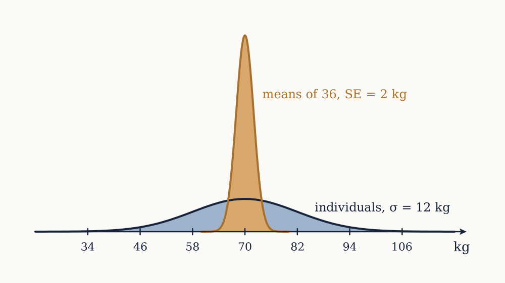
Example. Adult body mass in a population has μ=70 kg and σ=12 kg. A simple random sample of 36 people is taken. What is the standard error of the sample mean?

SE=12/36=2 kg. Individuals scatter by 12 kg, and means of 36 scatter by 2 kg, a sixfold reduction bought with 36 observations.

Now you. How many people are needed to bring the standard error down to 0.5 kg?

Answer

Set 12/n=0.5, so n=24 and n=576. Four times the precision of the 36-person sample costs sixteen times the people.

The exact result for a normal population

If the population is itself normal, no approximation is needed at any n. The probability course established that a sum of independent normal variables is normal, so X is exactly normal with mean μ and standard deviation σ/n, for n=2 as much as for n=2000.

That gives probabilities immediately by standardising. For the body mass example with n=36,

P(67X73)=P(|X-702|1.5)=2Φ(1.5)-1=0.8664

so a sample of 36 lands within 3 kg of the truth about 87 times in 100. With n=144 the standard error is 1, the same 3 kg becomes three standard errors, and the probability rises to 0.9973.

This is the clean case, and it is also the rare one. Body mass is roughly normal; waiting times, incomes, counts of rare events and yes-or-no answers are not. What rescues the general case is that the normality is not needed in the population at all.

The central limit theorem, put to work

The probability course proved it, and here is what it does. For independent draws from any population with finite mean μ and finite variance σ2,

X-μσ/nZ

in distribution as n grows, with Z standard normal. The population's own shape washes out entirely, leaving a limit that depends on it only through μ and σ.

The practical reading is that for large enough n the two exact results above can be used as approximations for any population whatsoever. That is what makes a single normal table sufficient, and it is why the normal curve appears in analyses of data that is obviously not normal, such as counts of successes or answers on a five-point scale. The claim was never that the data is normal. It is that the mean of enough of it behaves as though it were.

Two limits on the theorem are worth stating now rather than discovering later. It requires a finite variance, and distributions with infinite variance genuinely do not obey it. And it is a statement about the centre of the distribution: convergence in the far tails is much slower than convergence near the middle, so an approximation that is excellent for the middle 95 per cent can still be wrong by a factor of several in the extreme tail, which matters when the question is about rare failures.

Example. Service times at a counter are exponentially distributed with mean 4 minutes, so σ=4 minutes as well. For a sample of 50 customers, estimate the probability that the mean service time exceeds 5 minutes, and compare with the exact answer.

The standard error is 4/50=0.5657, so z=(5-4)/0.5657=1.768 and the normal approximation gives 1-Φ(1.768)=0.0385. The sum of 50 independent exponentials has a gamma distribution, which can be computed exactly, and the true probability is 0.0460. The approximation understates the tail by about 16 per cent of its value, because the exponential is right-skewed and 50 is not many.

Now you. For 200 customers, what is the standard error, and what does the normal approximation give for the probability that the mean exceeds 4.5 minutes?

Answer

SE=4/200=0.2828, so z=0.5/0.2828=1.768 and the approximation is again 0.0385. The exact gamma answer is 0.0425, so quadrupling the sample cut the relative error of the approximation from 16 per cent to 10 per cent.

How large is large enough

The usual textbook answer is "about 30", and it is a rule of thumb that hides a wide range. The honest answer depends on how skewed the population is and on which part of the distribution matters, and it can be settled by computing exact tails for known cases.

Take an exponential population and ask how often X exceeds μ+1.645σ/n, which the normal approximation says should be 5 per cent of the time. The exact answers are 6.7 per cent at n=5, 6.4 per cent at n=10, 5.9 per cent at n=30, 5.5 per cent at n=100 and 5.2 per cent at n=1000. The convergence is real and it is slow: a thousand observations from a skewed population still leaves a nominal 5 per cent tail that is actually 5.2.

Bernoulli data is worse when p is extreme, because the distribution is squashed against a boundary. With p=0.1 the same nominal 5 per cent upper tail is 7.3 per cent at n=30, 7.3 per cent at n=100 and 5.5 per cent at n=300. The working rule from the probability course, that np and n(1-p) should both exceed about 10, is the right one, and it is a statement about np rather than about n.

At the other extreme, a uniform population is symmetric and short-tailed, and the mean of just four draws is already close enough to normal for most purposes. Symmetry is what the approximation likes; skew is what it struggles with, because the leading correction term to the normal approximation is proportional to the population's skewness divided by n.

The standard error when the population variance is unknown

There is a circularity in everything above. The standard error σ/n contains σ, a population parameter, and if μ is unknown then σ almost certainly is too. The practical move is to substitute the sample standard deviation s from the second lesson, giving the estimated standard error

SEˆ=sn

This is what every piece of software reports, and it costs something. The quantity (X-μ)/(s/n) has a random denominator as well as a random numerator, so it is more variable than the standardised version with σ in it, and its distribution has heavier tails than the normal. For large n the difference is negligible because s is then a precise estimate of σ; for small n it is not, and the correct distribution is the t, derived in the lesson on confidence intervals. Until then, the substitution is fine for n in the hundreds and misleading for n under about 30.

Example. A sample of 25 measurements has x=12.4 and s=3.0. Give the estimated standard error, and say what it does and does not describe.

SEˆ=3.0/25=0.6. That is an estimate of how much the sample mean would move from one sample of 25 to the next. It is not an estimate of how much individual measurements vary, which is 3.0, five times as large, and it is not a bound on how wrong the mean can be if the sampling was biased.

Now you. A second sample of 100 measurements from the same population gives s=3.2. What is its estimated standard error, and how does the spread of the data compare between the two samples?

Answer

SEˆ=3.2/100=0.32. The data is about as spread out in both samples, 3.0 against 3.2, as it should be since both estimate the same σ. Only the standard error fell, and it fell by the factor 4=2 that the larger sample bought.

Two distributions that must not be confused

It is worth separating the three distributions now in play, because they are routinely collapsed into one.

The population distribution is the shape of the values in the world: skewed, bimodal, discrete, whatever it happens to be. The sample distribution is the shape of the batch actually collected, which resembles the population more closely as n grows and never becomes normal unless the population is. The sampling distribution of X is the shape of the estimate across hypothetical repetitions, and it becomes normal as n grows regardless of the other two.

A histogram of 10,000 incomes is right-skewed and stays right-skewed no matter how much more data arrives, because it is estimating the population shape and the population is skewed. The sampling distribution of the mean of those 10,000 incomes is very nearly normal with a standard deviation 100 times smaller than the spread of the data. Both facts are true simultaneously, and a report that shows the first while quoting an interval based on the second is not contradicting itself.

With the sampling distribution in hand, the sample mean can be defended as an estimator: it is centred correctly and its spread is known. What has not been asked is whether it was the best statistic to use, or where the n-1 in s2 came from, or what to do for a parameter with no obvious sample analogue. Those are the questions of the next lesson.

What makes an estimator good

The sample mean turned out to be centred on the population mean with a spread of σ/n, which is reassuring but does not say it was the right choice. The median would also have been available, and so would the midpoint of the range, and for parameters with no obvious sample analogue there is no default at all. This lesson sets up the criteria that decide between candidates.

An estimator is a rule

Keep two things apart. An estimator is a rule: a function that turns any sample into a number, written θˆ=T(X1,dots,Xn) with capital letters because its inputs are random. An estimate is what that rule produces from the particular sample in hand, a single number with nothing random about it.

Every property discussed below belongs to the rule, not to the estimate. Saying that X is unbiased is a statement about what happens across all possible samples; it says nothing about whether x=5.448 is close to the truth in this instance, and it cannot, because the truth is unknown. This is the same shift the first lesson described, from claims about one conclusion to claims about a procedure, and it is what makes the subject tractable.

There are usually many candidate rules. For a symmetric population the mean, the median and the midrange all estimate the same centre. For the maximum of a uniform distribution on [0,θ], the sample maximum and twice the sample mean both estimate θ. Choosing between them requires a definition of good.

Bias

The bias of an estimator is how far its sampling distribution is centred from the truth:

Bias(θˆ)=E[θˆ]-θ

An estimator with zero bias for every value of θ is unbiased. The previous lesson showed E[X]=μ exactly, so the sample mean is unbiased for the population mean, at every sample size and for every population with a finite mean.

Bias is not the same as error. An unbiased estimator can be badly wrong on any given sample, and it is unbiased only in the sense that the errors cancel across repetitions. Conversely a biased estimator can be reliably close. The word carries a moral weight in ordinary English that it does not have here, and treating unbiasedness as a requirement rather than a property is the mistake this lesson is arranged to prevent.

Unbiasedness also fails to survive transformation. If θˆ is unbiased for θ, then g(θˆ) is generally biased for g(θ), because expectation does not pass through a nonlinear function. The sample variance s2 is unbiased for σ2, and yet s is biased low for σ: for a normal population with n=10, E[s]=0.9727σ, so the usual standard deviation is systematically 2.7 per cent too small. At n=25 the factor is 0.9896 and at n=100 it is 0.9975, so the problem fades, but it never vanishes and almost nobody corrects for it.

Where the n-1 comes from

This is the derivation everyone is promised and rarely shown. Consider the sum of squared deviations from the sample mean, SS=i=1n(Xi-X)2, and rewrite each deviation by inserting the true mean:

Xi-X=(Xi-μ)-(X-μ)

Square and sum over i. The cross term is -2(X-μ)i(Xi-μ), and i(Xi-μ)=n(X-μ), so the cross term is -2n(X-μ)2, while the last term sums to n(X-μ)2. Two of them cancel one, leaving the identity

i=1n(Xi-X)2=i=1n(Xi-μ)2-n(X-μ)2

Now take expectations. Each E[(Xi-μ)2] is σ2 by definition, giving nσ2 for the first sum. And E[(X-μ)2] is the variance of the sample mean, which the previous lesson found to be σ2/n, so the second term has expectation n(σ2/n)=σ2. Therefore

E[SS]=nσ2-σ2=(n-1)σ2

Dividing SS by n gives an expectation of n-1nσ2, which is too small; dividing by n-1 gives exactly σ2. That is the whole justification, and the identity above shows precisely where the loss comes from: deviations are measured from X, which sits closer to the data than μ does by exactly (X-μ)2 per observation on average.

The usual verbal gloss, that one degree of freedom is used up estimating the mean, is a summary of that algebra rather than an argument. It does generalise: when k parameters are estimated before computing residuals, the divisor becomes n-k, which is why the regression lesson divides by n-2.

Example. A sample of 5 values from a population with σ2=100 is taken, and the analyst divides the sum of squared deviations by 5 instead of 4. What does that estimator average out to?

By the result above, E[SS]=4×100=400, so dividing by 5 gives an expectation of 80. The estimator is biased low by 20 per cent of the true variance, and no amount of repeating the experiment removes it, since 20 per cent is the average behaviour.

Now you. For n=20, what fraction of σ2 does the divide-by-n estimator average out to?

Answer

(n-1)/n=19/20=0.95, so it is 5 per cent too low. The bias is -σ2/n, which shrinks as n grows and is exactly why the two divisors are indistinguishable in large samples.

Variance and mean squared error

Centring is only half of the question. An estimator that is unbiased but wildly variable is worse than a slightly off-centre one that barely moves. The measure combining both is the mean squared error,

MSE(θˆ)=E[(θˆ-θ)2]=Var(θˆ)+Bias(θˆ)2

and the decomposition is worth deriving, since it is three lines. Write θˆ-θ=(θˆ-E[θˆ])+(E[θˆ]-θ). Squaring gives three terms; the first has expectation Var(θˆ), the third is a constant equal to the squared bias, and the cross term has expectation zero because E[θˆ-E[θˆ]]=0. So MSE splits cleanly into a spread part and an off-centre part, and minimising it means trading one against the other.

That trade is real, not hypothetical. For a normal sample, consider estimating σ2 by cSS for a constant c. Choosing c=1/(n-1) gives the unbiased s2, with MSE=2σ4/(n-1). Choosing c=1/(n+1) introduces a small downward bias and minimises the MSE. At n=10 the unbiased choice has MSE 0.2222σ4 and the biased one has 0.1818σ4, eighteen per cent lower. The biased estimator is closer to the truth on average, by the squared-error standard, and the unbiased one is still the one everybody uses, largely because unbiasedness composes nicely across later calculations.

Example. Draws come from a uniform distribution on [0,θ]. Two estimators of θ are 2X and n+1nM, where M is the sample maximum. Both are unbiased. Compare their variances at n=10.

The uniform has mean θ/2 and variance θ2/12, so Var(2X)=4(θ2/12)/n=θ2/(3n), which is θ2/30=0.0333θ2. The maximum has E[M]=nθ/(n+1) and the rescaled version has variance θ2/(n(n+2)), which is θ2/120=0.00833θ2. The maximum-based estimator has a quarter of the variance, because the largest observation carries nearly all the information about an upper limit while the other nine contribute almost nothing.

Now you. How does the advantage change with n? Compare the two variances as formulas.

Answer

The ratio is θ2/(3n)θ2/(n(n+2))=n+23, so the advantage grows without limit. The mean-based estimator improves as 1/n while the maximum-based one improves as 1/n2, which is a different and much faster rate.

Consistency

A minimum requirement is that more data should help. An estimator is consistent if θˆ converges in probability to θ as n grows: for any tolerance ε, the probability of missing by more than ε goes to zero.

The sample mean is consistent by the weak law of large numbers, proved in the probability course, and the argument is available directly from Chebyshev's inequality: P(|X-μ|ε)σ2/(nε2), which goes to zero. More generally, any estimator whose bias and variance both tend to zero is consistent, since its MSE tends to zero.

Consistency is weak, and it is worth knowing how weak. It says nothing about any finite sample size, so an estimator can be consistent and useless at n=500. It is also easy to satisfy: adding 106/n to a consistent estimator leaves it consistent while making it absurd for realistic samples. Its real value is as a filter: an inconsistent estimator is disqualified, because it does not converge on the answer even with unlimited data. The first lesson's biased thermometer is exactly that, converging with beautiful precision on the wrong number.

Efficiency, and the reason the mean usually wins

Among unbiased estimators, the one with the smallest variance is called efficient, and comparing two is done by the ratio of their variances. For a normal population the sample mean has variance σ2/n, while the sample median has variance approaching πσ2/(2n)=1.571σ2/n for large n. The relative efficiency of the median is therefore 2/π=0.637: a median computed from 1000 observations carries the information of a mean computed from 637.

There is a floor on how well any unbiased estimator can do, given by the Cramér-Rao bound, which says that the variance of an unbiased estimator is at least the reciprocal of the Fisher information in the sample. The next lesson introduces that quantity properly. What matters here is that the bound exists, that the sample mean attains it for normal data, and that "the mean is best" is therefore a theorem under stated assumptions rather than a habit.

Change the assumptions and the answer changes. For a Laplace population, whose density is proportional to e-|x-μ| and which has heavier tails than the normal, the median is the efficient estimator and the mean is the wasteful one. For a population with occasional gross errors, the mean's variance can be arbitrarily bad while the median's is not. The second lesson's advice, mean for clean symmetric data and median for contaminated data, is the practical statement of exactly this.

Example. An analyst has 1000 observations from a normal population and reports the median rather than the mean, to be safe against outliers. What has that caution cost, expressed in sample size?

The median's variance is π/2 times the mean's, so the analysis has the precision of 1000×2/π=637 observations. The 363 discarded observations are the insurance premium, and it is worth paying only if outliers are a real prospect.

Now you. A study reports means and wants the same precision the median would give from 2000 observations. How many observations does it need?

Answer

The mean needs 2000×2/π=1273 observations to match a median computed from 2000. The comparison runs both ways: the efficient estimator needs fewer observations for the same precision.

What is still missing

There are now criteria: bias, variance, mean squared error, consistency and efficiency, and enough machinery to compare any two candidate rules. What there is not is a way to produce candidates. Every estimator used so far was guessed by analogy, replacing a population mean by a sample mean, a population maximum by a sample maximum, and that analogy runs out quickly. Nothing in it says how to estimate the rate of a Poisson process from interval counts, or the two parameters of a distribution at once, or a parameter that appears only inside an exponential.

What is needed is a general recipe that takes a probability model and returns an estimator, ideally one that is automatically consistent and efficient in large samples. That recipe exists and is the subject of the next lesson.

Maximum likelihood

Every estimator so far was found by analogy: to estimate a population mean, take a sample mean. That runs out as soon as the parameter is not a simple feature of the distribution, and it gives no guidance at all when two parameters have to be estimated together. This lesson gives the general recipe, which Ronald Fisher developed between 1912 and 1922 and which underlies almost every estimate produced by statistical software today.

The likelihood function

Start with a model that says how probable the data is, given a parameter. For discrete data, P(data|θ) is an ordinary probability; for continuous data it is a density. Now hold the data fixed at what was actually observed and read the expression as a function of θ. That function is the likelihood,

L(θ)=P(x1,dots,xn|θ)

and for independent observations it factorises into if(xi|θ).

The idea is then blunt: prefer the value of θ that makes the observed data as probable as it can be. The maximum likelihood estimator is

θˆ=argmaxθL(θ)

Two cautions about reading the likelihood, and they are the same caution twice. L(θ) is not the probability that θ is true; θ is a fixed unknown constant and has no probability distribution in this framework. And L is not a density in θ: it does not integrate to one, and its value at a point has no meaning on its own. Only ratios of likelihoods at different θ carry information, which is why the maximum is what gets used.

Why the logarithm

In practice one maximises (θ)=lnL(θ) instead. Since the logarithm is strictly increasing, the maximum is at the same place, and the product over observations becomes a sum:

(θ)=i=1nlnf(xi|θ)

Sums differentiate one term at a time, and they do not underflow: the likelihood of 1000 observations each of probability around 0.3 is about 10-523, which is zero in double precision, while its logarithm is a comfortable -1204. Every serious implementation works on the log scale for both reasons.

The recipe is then calculus. Differentiate , set the derivative to zero, solve, and check the second derivative is negative. The derivative (θ) is called the score, and the equation (θ)=0 is the likelihood equation.

The Bernoulli case

Let each observation be 0 or 1 with P(X=1)=p, and suppose k of n observations are 1. Then

L(p)=pk(1-p)n-k,(p)=klnp+(n-k)ln(1-p)

Differentiating, (p)=kp-n-k1-p. Setting this to zero gives k(1-p)=(n-k)p, so k=np and

pˆ=kn

The sample proportion, which everybody would have written down anyway, is the maximum likelihood estimator, and now it is derived rather than assumed. The second derivative is ′′(p)=-k/p2-(n-k)/(1-p)2, negative everywhere, so this is a maximum.

Example. A coin gives 60 heads in 100 tosses. What is the maximum likelihood estimate of p, and how much more likely does it make the data than p=0.5?

pˆ=0.60. The likelihood ratio is 0.6600.4400.5100, whose logarithm is 60ln0.6+40ln0.4-100ln0.5=2.013, so the ratio is e2.013=7.5. The observed data is 7.5 times more probable under p=0.6 than under a fair coin, which is a preference and nowhere near a proof.

Now you. A different coin gives 7 heads in 20 tosses. What is pˆ, and what is the log likelihood ratio against p=0.5?

Answer

pˆ=0.35. The log ratio is 7ln0.35+13ln0.65-20ln0.5=0.914, so a ratio of 2.5. Weaker evidence from a smaller sample, as expected.

Poisson, exponential and normal

The same three steps handle every standard model, and the answers are worth having.

For Poisson counts with mean λ, (λ)=i(xilnλ-λ-lnxi!), so (λ)=xiλ-n, and λˆ=x. For exponential waiting times with rate λ, the density is λe-λx, so (λ)=nlnλ-λxi, giving λˆ=1/x.

For the normal with both parameters unknown,

(μ,σ2)=-n2ln(2π)-n2lnσ2-12σ2i(xi-μ)2

Differentiating with respect to μ gives 1σ2(xi-μ)=0, so μˆ=x whatever σ2 is. Substituting that and differentiating with respect to σ2 gives

σˆ2=1ni(xi-x)2

which is the divide-by-n version, not s2. Maximum likelihood is biased here, by exactly the factor (n-1)/n derived in the previous lesson, so at n=10 it is 10 per cent low. That is a real defect and a small one: the bias vanishes as n grows, and no general recipe can be both automatic and unbiased for every parameter at once.

Example. Ladislaus Bortkiewicz recorded deaths from horse kicks in 14 Prussian cavalry corps, and the classic subset covers 200 corps-years with 122 deaths. Estimate the Poisson rate and give its standard error, using SE=λ/n.

λˆ=122/200=0.61 deaths per corps-year, and SE=0.61/200=0.055. The estimate is about eleven standard errors away from zero and about seven from one, so the data pins the rate down well.

Now you. Fifty service times have mean 4.0 minutes. Estimate the exponential rate λ and its standard error, given that SE(λˆ)=λ/n.

Answer

λˆ=1/4.0=0.25 per minute, and SE=0.25/50=0.0354 per minute.

Curvature is precision

The recipe so far returns a point. It also returns, for free, an estimate of how precise that point is, and the mechanism is geometric: a sharply peaked log likelihood means that nearby parameter values explain the data much worse, so the data is informative; a flat one means many values do nearly as well.

Sharpness is curvature, so define the observed information as the negative second derivative of the log likelihood at the maximum, J=-′′(θˆ). The Fisher information is its expected value, I(θ)=-E[′′(θ)]. The large-sample result is that

SE(θˆ)1I(θ)

For the Bernoulli case, -′′ evaluated at pˆ=k/n works out to npˆ(1-pˆ), so

SE(pˆ)=pˆ(1-pˆ)n

which is the formula used without justification in the first lesson, now derived. For the Poisson, ′′=-xi/λ2, whose negative expectation is n/λ, giving SE=λ/n. For the normal mean, the same route returns σ/n, agreeing with the exact derivation two lessons back.

There is a strong theorem behind this. Under regularity conditions, as n grows the maximum likelihood estimator is consistent, its distribution approaches a normal centred at the true θ with variance 1/I(θ), and that variance attains the Cramér-Rao lower bound. So maximum likelihood is asymptotically the best possible unbiased procedure, which is why it is the default and why almost every standard error printed by software is a square root of an inverse information.

Example. In a sample of 400 voters, 240 support a proposal. Give the maximum likelihood estimate and its standard error.

pˆ=240/400=0.60 and SE=0.6×0.4/400=0.0245. Doubling the sample from the 100-toss example halved neither the estimate nor the standard error but divided the latter by 4=2, from 0.049 to 0.0245.

Now you. With 14 successes in 40 trials, what are pˆ and its standard error?

Answer

pˆ=0.35 and SE=0.35×0.65/40=0.0754.

Invariance, and what it costs

A convenient property: maximum likelihood is invariant under reparameterisation. If θˆ maximises the likelihood for θ, then g(θˆ) is the maximum likelihood estimate of g(θ) for any function g, because relabelling the axis does not move the peak.

So from pˆ=0.6, the maximum likelihood estimate of the odds p/(1-p) is 0.6/0.4=1.5, and of the log odds is ln1.5=0.405, with no fresh optimisation. Nothing comparable holds for unbiasedness, which is destroyed by nonlinear transformation as the previous lesson showed. Invariance is one of the reasons the method has spread: parameters get reparameterised constantly, into odds, rates, logs and proportions, and the estimates travel with them.

Standard errors travel too, by the delta method: if θˆ has standard error σθˆ, then g(θˆ) has approximate standard error |g(θˆ)|σθˆ, which is the first term of a Taylor expansion. For the log odds, g(p)=1/(p(1-p)), so the standard error of ln(pˆ/(1-pˆ)) at pˆ=0.6 with n=100 is 0.049/(0.6×0.4)=0.204. Every odds ratio reported with an interval in a medical journal comes from that calculation.

Where the method fails

The asymptotic theory rests on regularity conditions, and it is worth knowing the two ways they break.

The first is a parameter on the boundary of the support. For a uniform distribution on [0,θ], the likelihood is θ-n for θmaxxi and zero below, so it has no stationary point at all: it is maximised at the smallest permitted value, θˆ=maxxi. Differentiating would have found nothing. This estimator is biased low, since the maximum of a sample can never exceed θ, with E[θˆ]=nθ/(n+1), and its sampling distribution is nowhere near normal even for large n. The previous lesson's rescaled version repairs the bias, and the normal approximation never arrives.

The second is small samples generally. Everything above is asymptotic, and "asymptotic" is not a sample size. With n=8, a standard error taken from the curvature of the log likelihood can be badly wrong, and the estimator's distribution can be visibly skewed. Separation in logistic regression is the everyday version: when one group has no failures at all, the likelihood is maximised at an infinite coefficient, software reports an enormous estimate with an enormous standard error, and the honest conclusion is that the data cannot identify that parameter.

Maximum likelihood now supplies both an estimate and a standard error for essentially any model. A single number with a standard error beside it is still a poor way to communicate a result, because it invites the reader to treat the number as the answer. Turning the pair into an interval with a stated and checkable property is the next lesson.

Confidence intervals

An estimate with a standard error beside it contains everything needed to say how precise it is, and almost nobody reads it that way. A confidence interval packages the same two numbers into a range, which is harder to misread and, as it turns out, still routinely misread. This lesson derives the construction, states exactly what it guarantees, and shows a case where the standard textbook interval does not deliver what it advertises.

From a point to a range

Suppose θˆ is approximately normal around θ with standard error σθˆ, which the maximum likelihood theory of the previous lesson supplies for nearly any model. Then before the data is seen,

P(-1.96θˆ-θσθˆ1.96)=0.95

since the middle quantity is standard normal and Φ(1.96)=0.975. The inequalities can be rearranged so that θ sits alone in the middle:

P(θˆ-1.96σθˆθθˆ+1.96σθˆ)=0.95

The interval θˆ±1.96σθˆ is the 95 per cent confidence interval. The quantity that made this work, (θˆ-θ)/σθˆ, is called a pivot: a function of both the data and the parameter whose distribution does not depend on the parameter. Every interval in this course is built the same way, by finding a pivot, writing down a probability statement about it, and solving for the parameter.

The rearrangement is algebra, and the interpretation is where care is required, because the probability statement was made before the data arrived and the interval is written after.

What the 95 per cent is a statement about

The correct reading is about the procedure. If the study were repeated many times, with a fresh sample each time and the interval recomputed each time, 95 per cent of those intervals would contain the true θ. That is the guarantee, and it is a guarantee about a rule, exactly as in the lesson on estimators.

The incorrect reading, and it is the one most people carry, is that there is a 95 per cent probability that θ lies inside this particular interval. Once the data is in hand, the interval is a pair of fixed numbers and θ is a fixed unknown constant, so θ is either in it or not, and no probability between 0 and 1 applies. Saying "95 per cent confident" is a way of not saying "95 per cent probable", and the distinction is not pedantry: a reader who believes the second will happily interpret a 95 per cent interval that runs from 0.1 to 12 as though the middle of it were more probable than the ends, and the frequentist construction says nothing of the sort.

Two consequences follow directly. A 99 per cent interval is wider than a 95 per cent one, since a stricter coverage requirement needs more room: the multiplier moves from 1.96 to 2.576. And the confidence level is chosen by the analyst before looking, because choosing it afterwards to make an interval exclude some value destroys the property being claimed.

Gosset's t

The interval above used σθˆ, which for a mean is σ/n and contains the unknown population standard deviation. Substituting s seems harmless and is not, for small n: the quantity

T=X-μs/n

has a random denominator, so it varies more than a standard normal does, and using 1.96 gives intervals that are too narrow and cover less often than advertised.

William Gosset, a brewer at Guinness in Dublin working with samples of four or five barley plots, worked out the exact distribution of T in 1908 and published it as "Student" because his employer treated statistical methods as a trade secret. For a normal population, T follows the t distribution with n-1 degrees of freedom: symmetric, centred at zero, and with heavier tails than the normal, converging to the normal as the degrees of freedom grow.

The practical effect is entirely in the multiplier. For a 95 per cent interval it is 2.776 at 4 degrees of freedom, 2.262 at 9, 2.045 at 29, 1.979 at 129 and 1.960 in the limit. Beyond about 30 observations the correction is under 5 per cent and beyond 100 it is under 1 per cent, which is why large-sample work ignores it and small-sample work cannot. The interval is

x±t0.975,n-1sn

The t distribution assumes a normal population, and that assumption matters most exactly where the correction does, at small n, since the central limit theorem has not had a chance to work. For n under about 15 with visibly skewed data, neither the normal nor the t interval is trustworthy.

A worked interval on real data

Body temperature is conventionally 37 °C, or 98.6 °F, a figure due to Carl Wunderlich's measurements in the 1860s. In 1992 Mackowiak and colleagues remeasured it, and the 130 readings tabulated from that work have x=98.249 °F and s=0.733 °F.

The estimated standard error is 0.733/130=0.0643 °F. With 129 degrees of freedom the multiplier is 1.9785, so the margin is 1.9785×0.0643=0.127 °F and the interval is

98.249±0.127=(98.122,98.376)°F

which in Celsius is 36.734 to 36.876, centred on 36.805 °C. The conventional 98.6 °F lies well outside it: it is (98.249-98.6)/0.0643=5.46 standard errors away, which is the kind of distance the normal curve makes essentially impossible by chance. The interval says the mean is near 36.8 °C and not 37 °C, and it says so with a precision of about a tenth of a degree Fahrenheit.

Example. A sample of 25 measurements has x=12.4 and s=3.0. Construct the 95 per cent confidence interval for μ.

The estimated standard error is 3.0/25=0.6. With 24 degrees of freedom the multiplier is 2.064, so the margin is 1.238 and the interval is (11.16,13.64). Using 1.96 instead would give a margin of 1.176, about 5 per cent too narrow.

Now you. A sample of 10 has x=50.0 and s=4.0. Construct the 95 per cent interval.

Answer

The standard error is 4.0/10=1.265, the multiplier at 9 degrees of freedom is 2.262, so the margin is 2.861 and the interval is (47.14,52.86). At this sample size the t multiplier is 15 per cent above 1.96, which widens the interval by the same 15 per cent.

Intervals for a proportion

For a proportion the same recipe gives the Wald interval,

pˆ±1.96pˆ(1-pˆ)n

using the standard error derived from the Fisher information in the previous lesson. With 240 supporters out of 400, pˆ=0.60, the standard error is 0.0245 and the interval is (0.552,0.648).

This is the interval in every introductory course, and its actual coverage is not 95 per cent. Because the binomial is discrete and pˆ appears in the standard error as well as at the centre, the true coverage can be computed exactly by summing binomial probabilities over the outcomes whose intervals contain p. At n=20 and p=0.3 the coverage is 94.7 per cent, tolerable; at n=20 and p=0.1 it is 87.6 per cent, which means a nominal one-in-twenty failure rate is really one in eight. The failure is worst near the boundaries and it does not disappear quickly: at n=100 and p=0.1 the coverage is still 93.2 per cent.

The pathological case shows the mechanism. If k=0, then pˆ=0, the estimated standard error is zero, and the Wald interval is the single point [0,0]: the procedure claims certainty from data that plainly does not supply it. The Wilson interval repairs this by not substituting pˆ for p in the standard error and instead solving the quadratic inequality |pˆ-p|1.96p(1-p)/n for p. It is

pˆ+z22n±zpˆ(1-pˆ)n+z24n21+z2n

which is uglier and behaves far better: at n=20 and p=0.1 its coverage is 95.7 per cent, and with k=0 out of 20 it gives (0,0.161) instead of a point. That upper limit is close to the familiar rule of three, which says that seeing no events in n trials is consistent with a rate up to about 3/n, here 0.15; the exact one-sided 95 per cent limit is 1-0.051/20=0.139.

Example. In a trial, 0 of 50 patients had a serious adverse reaction. What upper limit on the true rate does that support?

The rule of three gives 3/50=0.06, so rates up to about 6 per cent are consistent with seeing nothing. The exact one-sided 95 per cent limit is 1-0.051/50=0.0582. Reporting "no adverse reactions were observed" without this limit invites the reader to conclude the rate is near zero, when a rate of one in twenty would produce this result about 8 per cent of the time.

Now you. A survey of 400 finds 240 in favour. Give the Wald interval, and say why it is reliable here when it was not in the example above.

Answer

0.60±1.96(0.0245)=(0.552,0.648). Both npˆ=240 and n(1-pˆ)=160 are far from the boundaries, which is exactly the regime where the normal approximation to the binomial is accurate, so the Wald coverage here is close to its nominal value.

Choosing the sample size

Since the margin is zσ/n, fixing the margin fixes n. For a proportion in the worst case p=0.5, a margin of 3 percentage points needs n=1.962(0.25)/0.032=1068, which is where the standard poll size comes from. A margin of 2 points needs 2401 and a margin of 1 point needs 9604.

This is the 1/n law from the first lesson, written as a budget. It also makes the honest planning question visible: what width would make the result useful? An interval on a treatment effect running from "harmful" to "wildly beneficial" answers nothing, however correctly it was computed, and the time to discover that is before the study, not after.

Example. A study can afford 1000 participants and expects a proportion near 0.5. What margin can it promise, and what would halving the margin cost?

The margin is 1.960.25/1000=0.031, about 3 points. Halving it to 1.55 points requires four times the sample, 4000 participants.

Now you. What sample size gives a margin of 2 percentage points at p=0.5?

Answer

n=1.962(0.25)/0.022=2401.

What the interval does not cover

The width of a confidence interval is computed entirely from sampling variability, so it describes only the error that random sampling produces. It is silent about everything else: a biased frame, differential non-response, an instrument reading high, a question worded to lead. The third lesson's Literary Digest interval would have been about 0.06 points wide and would have missed the truth by 17.8.

It is also silent about the model. A t interval assumes a normal population and independent observations, and a survey that ignores clustering can produce an interval 40 per cent too narrow, as the design effect calculation showed. And an interval is a statement about one parameter: constructing twenty of them and reporting the one that excludes zero destroys the coverage property, a point the lesson on errors takes up directly.

With intervals available, one whole class of question is answered: how large is the effect, with what precision. The other class is whether there is any effect at all, and although the two turn out to be the same question in different clothing, the second has its own machinery, its own vocabulary and its own famous ways of going wrong. That is next.

Testing a hypothesis

A confidence interval answers "how large is it, and how precisely do we know". A great many questions are cruder than that: does this drug do anything, is this coin bent, did the yield actually change. Testing is the machinery for those, and it is simultaneously the most used and the most misdescribed tool in the subject.

The question a test answers

The logic is a proof by contradiction with the certainty removed. To argue that an effect exists, assume it does not, work out what the data would then look like, and see whether what was observed is the kind of thing that assumption comfortably produces. If it is not, the assumption is doubted. If it is, nothing has been shown either way.

The assumption is the null hypothesis H0, and it must be specific enough to compute with: p=0.5, or μ=98.6, or "the treatment and control distributions are identical". The alternative H1 is what is entertained instead, usually a whole range such as p0.5. The asymmetry is deliberate and permanent: the null is the one whose consequences can be calculated, so it is the one that gets tested, and it is never the one that gets proved.

That asymmetry is the source of the most common error in reporting. Failing to reject the null is not evidence that the null is true. A study of eight patients will fail to reject almost any null, because it has no ability to detect anything, and "no significant difference was found" from such a study means only that the study was incapable of finding one. The next lesson makes that precise.

The test statistic and the p-value

A test statistic is a number computed from the data whose distribution under H0 is known, and which is large when the data disagrees with H0. For a mean it is usually

t=x-μ0s/n

the distance from the null value measured in estimated standard errors, which under H0 follows the t distribution of the previous lesson.

The p-value is the probability, computed under H0, of getting a test statistic at least as extreme as the one observed. That is the whole definition, and every word in it is load-bearing. It is a probability about data, not about hypotheses. It is conditional on the null being true. And "at least as extreme" means the tail, not the point, since for continuous data any exact value has probability zero.

A small p-value says the observed data would be unusual if H0 held. That is grounds for doubting H0, and it is not a probability that H0 is false: the probability of the data given the hypothesis is not the probability of the hypothesis given the data, which is the reversal Bayes' theorem exists to handle and which the probability course named the prosecutor's fallacy. A p-value of 0.03 does not mean a 3 per cent chance the null is true; that number cannot be computed without a prior.

The conventional threshold of 0.05 is Fisher's, offered in 1925 as a convenient line and not as a law of nature. It has no theoretical standing whatever, and treating 0.049 and 0.051 as different in kind is the single most damaging habit in applied statistics.

One tail or two

If the alternative is p0.5, deviations in either direction count against the null and the p-value sums both tails. If the alternative is one-directional, only one tail counts, and the p-value is half as large for the same data.

The temptation is obvious and the rule is strict: the direction must be chosen before seeing the data, on grounds that would have held whatever the data showed. Choosing one-sided after seeing which way the result went is halving the p-value by fiat, and it converts a nominal 5 per cent error rate into 10 per cent. Two-sided is the default for that reason, and a one-sided test needs a stated justification.

Example. A coin gives 60 heads in 100 tosses. Test H0:p=0.5 against p0.5, exactly.

Under the null the count is binomial with n=100 and p=0.5. The upper tail is P(X60)=0.02844, and by symmetry the two-sided p-value is 2(0.02844)=0.0569. At the conventional threshold this does not reach significance, which is worth sitting with: 60 heads out of 100 looks convincing and is not, and the one-sided version would have reported 0.028 and claimed the opposite.

Now you. What would the two-sided p-value be if the same 60 per cent came from 40 heads in a different experiment, tested against p=0.5 with n=100? Reason without computing.

Answer

Identical, 0.0569. The binomial with p=0.5 is symmetric about 50, so 40 is exactly as extreme as 60, and a two-sided test cannot distinguish the direction.

An exact test with no approximation

Ronald Fisher's colleague Muriel Bristol claimed she could tell whether milk or tea had been poured into the cup first. Fisher's design, published in 1935, was to prepare eight cups, four each way, tell her that there were four of each, and ask her to identify which four had the milk first.

Under the null hypothesis that she is guessing, every choice of four cups from eight is equally likely, and there are (84)=70 of them. Exactly one is entirely correct, so

P(all four correct|guessing)=170=0.0143

Getting three right can happen in (43)(41)=16 ways, so P(at least three correct)=17/70=0.243. Only a perfect score reaches the 5 per cent threshold, and the design says so in advance. Bristol, by the accounts of those present, identified all eight cups correctly.

Three features of this deserve notice. There is no approximation anywhere: the p-value is a count of arrangements, which is why it is called an exact test. The design was fixed before the experiment, including the number of cups and the fact that she was told there were four of each, and the calculation depends on both. And the test has a known and modest resolution: with six cups, three each way, there are (63)=20 arrangements, a perfect score gives p=0.05 exactly, and no result whatever could have produced a smaller p-value.

Example. With ten cups, five each way, what is the p-value of a perfect identification?

There are (105)=252 ways to choose five cups from ten, so a perfect score has p=1/252=0.0040. Adding two cups took the strongest possible evidence from p=0.014 to p=0.004.

Now you. With eight cups, what is the p-value if she gets exactly three of the four right?

Answer

At least three correct has probability 17/70=0.243, so p=0.24. Three out of four sounds impressive and is entirely ordinary under guessing.

The t test on real data

Return to the 130 body temperature readings, with x=98.249 °F and s=0.733 °F, and test the conventional value H0:μ=98.6 °F.

The estimated standard error is 0.733/130=0.0643, so

t=98.249-98.60.0643=-5.46

With 129 degrees of freedom the two-sided p-value is 2.4×10⁻⁷. Data like this is essentially impossible if the population mean really were 98.6, so the conventional figure is rejected, and the direction and size of the discrepancy are both worth stating: the estimate is 0.35 °F below the convention, or about 0.2 °C.

Notice how much more the interval said than the test. The test reports that 98.6 is implausible; the interval, (98.12,98.38), reports that and also that the mean is near 98.25 and pinned down to about a tenth of a degree. Whenever both are available, the interval is the better thing to publish, which is the recommendation of every set of reporting guidelines written in the last thirty years and is still the minority practice.

Example. A sample of 25 has x=12.4 and s=3.0. Test H0:μ=11 against a two-sided alternative.

The standard error is 3.0/25=0.6, so t=(12.4-11)/0.6=2.333 on 24 degrees of freedom, giving a two-sided p-value of 0.028. The null is rejected at the 5 per cent level.

Now you. Test the same sample against H0:μ=11.5.

Answer

t=(12.4-11.5)/0.6=1.50, and the two-sided p-value on 24 degrees of freedom is 0.147. The same data rejects 11 and does not reject 11.5, which is the duality of the next section in action.

Tests and intervals are the same thing

Those two results are not a coincidence. A two-sided test of H0:μ=μ0 at level α rejects exactly when μ0 lies outside the 1-α confidence interval for μ, and the reason is that both come from the same pivot. The interval is the set of null values that would not be rejected; the test asks whether one particular value is in that set.

For the sample above the 95 per cent interval is 12.4±2.064(0.6)=(11.16,13.64). The value 11 is outside it, so the test rejects; 11.5 is inside, so it does not. Nothing new was computed either time.

The practical consequence is that the interval strictly dominates the test as a report. It answers the test's question, by inspection, for every possible null value at once, and it additionally reports the size and the precision. A paper that reports only p=0.03 has thrown away information it already computed.

What a p-value is not

Five confusions, each responsible for a large literature.

It is not the probability that the null hypothesis is true. It is not the probability that the results are due to chance, which is the same error in casual dress. It is not a measure of the size of the effect: with n large enough, a difference of no practical consequence produces an arbitrarily small p-value, since t grows as n for any fixed discrepancy. It is not the probability of a replication succeeding. And a non-significant result is not evidence of no effect.

The last two of those are the subject of the next lesson, which asks what happens when the null is false: how often a real effect is detected, how many observations that takes, and why a study that finds significance without enough observations to have deserved it is worse than one that finds nothing at all.

Errors, power and sample size

The previous lesson controlled one error: rejecting a true null happens at most 5 per cent of the time, by construction. Nothing was said about the other direction, missing a real effect, and that omission is where most of the practical trouble in applied statistics lives. This lesson computes the second error rate, inverts it to choose a sample size, and shows why an underpowered study that reports a significant result has told you something misleading rather than something weak.

Two ways to be wrong

A test makes a binary decision against a binary truth, so there are two ways to be wrong and two ways to be right. Rejecting a null that is actually true is a type I error, and its probability is the significance level α, fixed by the analyst at 0.05 by convention. Failing to reject a null that is actually false is a type II error, and its probability is written β. The power of the test is 1-β, the probability of detecting an effect that is really there.

The asymmetry between them is structural. Setting α requires only the null model, which is fully specified, so it can be fixed in advance without knowing anything about the world. Computing β requires knowing how false the null is, since missing a tiny effect is easy and missing a huge one is not. So power is never a single number: it is a function of the effect size, and quoting "the power of the study" without saying at what effect is meaningless.

The two errors trade against each other in an obvious way. Lowering α to 0.01 makes rejection harder, which reduces type I errors and increases type II errors at every effect size. The only way to improve both at once is to collect more data, which is what makes sample size the central design decision rather than an administrative detail.

Computing power

Take the one-sample z test of H0:μ=μ0 against a two-sided alternative, with known σ for simplicity. The test rejects when |X-μ0|>z1-α/2σ/n. Suppose the truth is μ=μ0+δ. Then X is centred at μ0+δ rather than μ0, and standardising by the null's own scale gives a variable centred at

λ=δσ/n=δnσ

which is called the noncentrality parameter. The power is the probability that this shifted normal lands beyond the rejection boundary:

power=Φ(λ-z1-α/2)+Φ(-λ-z1-α/2)

The second term is the probability of rejecting in the wrong direction, which is negligible unless λ is tiny, and is usually dropped.

Everything about power is contained in λ, and λ depends on the effect only through the standardised effect size d=δ/σ, giving λ=dn. That is why effect sizes are reported in standard deviations: it makes power calculations transferable between studies measuring different things. Jacob Cohen's rough labels, d=0.2 small, 0.5 medium, 0.8 large, are conventions from the behavioural sciences and should be treated as vocabulary rather than physics.

Example. A study of 100 observations tests a two-sided hypothesis at α=0.05, and the true standardised effect is d=0.3. What is the power?

λ=0.3100=3, so the power is Φ(3-1.96)=Φ(1.04)=0.851. The study detects this effect about 85 times in 100, and misses it 15 times.

Now you. What is the power of the same study if the true effect is only d=0.2?

Answer

λ=0.2(10)=2, so the power is Φ(2-1.96)=Φ(0.04)=0.516. A smaller effect halves the detection rate: this study is a coin toss against a d=0.2 effect.

Sample size by inversion

Design usually runs the other way: fix the power you want and solve for n. Dropping the negligible term, power =1-β requires λ-z1-α/2=z1-β, so λ=z1-α/2+z1-β and

n=(z1-α/2+z1-β)2d2

At the standard α=0.05 and 80 per cent power, the multipliers are 1.960 and 0.8416, whose sum squared is 7.849, so n=7.849/d2. That gives 13 observations for d=0.8, 32 for d=0.5, 88 for d=0.3 and 197 for d=0.2.

Two things follow immediately. The sample size scales as 1/d2, so halving the effect you want to detect quadruples the study, which is the n law once more. And 80 per cent power, the usual target, means accepting a one-in-five chance of missing a real effect of exactly the size you designed for, which is a much weaker standard than the 5 per cent on the other side and is rarely presented that way.

The honest version of this calculation requires committing in advance to the smallest effect worth detecting, which is a scientific or clinical judgement rather than a statistical one. Running it backwards, plugging in whatever n is affordable and reporting the effect that would give 80 per cent power, is a common and useless ritual: it names an effect the study can detect, not one anybody had reason to expect.

Example. How many observations are needed for 80 per cent power against a standardised effect of d=0.5, two-sided at α=0.05?

n=7.849/0.25=31.4, so 32 observations. This is the calculation behind the folklore that "about 30" is enough, and it is enough only for an effect of half a standard deviation, which is large.

Now you. How many are needed for the same power against d=0.2?

Answer

n=7.849/0.04=196.2, so 197 observations. Two and a half times the effect size costs six times the sample.

The winner's curse

Here is the result that changes how published findings should be read. Suppose a real effect δ exists and the study has low power. Most of the time it will fail to reach significance. On the occasions when it does reach significance, the estimate must have been unusually large, because that is the only way an underpowered study crosses the threshold. So the published estimates, which are the significant ones, are systematically too big.

The size of the exaggeration can be computed from a truncated normal. Let the estimate be normal around δ, and condition on it exceeding 1.96 standard errors. The ratio of the expected published estimate to the true effect, sometimes called the exaggeration ratio or type M error, works out to

PowerExaggeration ratio
0.103.72
0.202.26
0.501.41
0.801.13

A study with 20 per cent power that reports a significant effect is reporting, on average, something 2.3 times the truth. At 10 per cent power it is nearly four times. This is not fraud or incompetence; it is what the threshold does to a noisy estimate, and it happens to a perfectly executed study.

That matters because low power is normal. Button and colleagues surveyed neuroscience in 2013 and estimated the median power of studies in that literature at about 21 per cent. A field working at 20 per cent power publishes findings that are real about as often as not and roughly twice as large as they should be, and then a better-powered replication finds a smaller effect and is read as a failure to replicate.

Example. A study has 20 per cent power against the true effect. It reports a significant result of d=0.60. What is a reasonable guess at the true effect?

Dividing by the exaggeration ratio of 2.26 gives about d=0.27. The published number is not wrong arithmetic; it is a biased sample of the estimates that study could have produced, and the bias is a property of the publication rule rather than of the analysis.

Now you. A well-powered study, 80 per cent, reports d=0.60. What correction applies?

Answer

Dividing by 1.13 gives about d=0.53, a correction of 12 per cent rather than a factor of two. High power is what makes a published estimate approximately trustworthy, which is a second and better reason to want it.

How often is a significant finding true

Combine power with the base rate, and the result is the calculation the probability course did for medical screening, applied to research itself. Suppose a fraction π of the hypotheses a field investigates are true, and studies run at level α with power 1-β. Then among all findings that reach significance, the fraction that are true is

PPV=π(1-β)π(1-β)+(1-π)α

which is Bayes' theorem with "true hypothesis" in place of "has the disease".

Take a field where one hypothesis in ten is true, so π=0.1. With 80 per cent power, the PPV is 0.08/(0.08+0.045)=0.64: about a third of significant findings are false. With 20 per cent power it falls to 0.02/(0.02+0.045)=0.31, so most published significant findings in that field are wrong. This is the core of John Ioannidis's 2005 argument, and every input to it is a quantity the field controls: the ambition of the hypotheses, the power of the studies, and the threshold.

Notice which lever moves the answer most. Raising power from 0.2 to 0.8 quadruples the numerator; tightening α from 0.05 to 0.005 divides the second denominator term by ten. Both help, and neither helps if the reported p-values came from an analysis chosen after seeing the data, which is the subject of the final lesson.

What follows from all this

Three practical rules come out of this lesson, and they are the ones that survive contact with real work.

Decide the smallest effect worth detecting before the study, and compute the sample size from it. If the required n is unaffordable, that is information: the study as conceived cannot answer the question, and running it anyway produces a result whose most likely outcomes are a null finding that means nothing and a significant one that is inflated.

Report the estimate and its interval rather than the verdict. A wide interval around a large point estimate is visibly uninformative, whereas "p=0.03" from the same data looks like a discovery.

Read a surprising result from a small study as an overestimate by default. The exaggeration ratios above give the size of the discount, and it depends only on the power, which can be reconstructed roughly from the reported interval.

All of this concerned one sample compared with a fixed value. Almost every real question compares two groups instead, which changes the arithmetic in ways worth doing carefully, and that is next.

Comparing two groups

Almost no real question is whether a mean equals a fixed number. The questions are whether treated patients do better than untreated ones, whether a change to a process improved it, whether two populations differ. All of those compare two groups, and the arithmetic depends on how the two groups were formed, which is a fact about the design rather than about the data.

Two designs, and why the difference matters

In a paired design each observation in one group has a natural partner in the other: the same patient before and after, two plants in the same pot, matched twins. In an independent samples design the two groups are separate sets of units with no correspondence between them.

The distinction is not a formality, because pairing removes a source of variation. If plants differ enormously from pot to pot but the two plants within a pot are alike, then comparing group means drowns the treatment effect in pot-to-pot variation, while comparing within pots does not. Analysing paired data as though it were independent throws that advantage away and usually turns a clear result into a null one. Analysing independent data as though it were paired is not possible, since there are no pairs, but pairing on something irrelevant wastes degrees of freedom for nothing.

The rule is simple: pair when the units genuinely come in linked couples, and let the design decide the analysis rather than the other way round.

Paired data reduces to one sample

The trick with paired data is that it is not a two-sample problem at all. Form the difference di=xi-yi within each pair and the question becomes whether those differences have mean zero, which is the one-sample t test of the previous lessons applied to n differences.

Charles Darwin measured this in 1876. He raised 15 pairs of Zea mays, one cross-fertilised and one self-fertilised plant in each pot, and recorded their final heights in eighths of an inch. The differences, cross minus self, were

49, -67, 8, 16, 6, 23, 28, 41, 14, 29, 56, 24, 75, 60, -48

Their mean is 20.93 eighths, about 2.62 inches, with s=37.74. The standard error is 37.74/15=9.75, so

t=20.939.75=2.148

on 14 degrees of freedom, giving a two-sided p-value of 0.0497. Fisher used exactly this dataset to introduce the paired t test, and it is an instructive choice: the result scrapes past 0.05 by three thousandths, two of the fifteen differences are strongly negative, and the 95 per cent interval for the mean difference runs from 0.03 to 41.8 eighths of an inch. The evidence for an effect is real and the size of it is barely constrained at all. Reporting only "p<0.05" would conceal that completely.

Example. Ten runners are timed before and after a training programme, and their improvements in seconds have mean 3.2 with standard deviation 4.0. Test whether the programme had any effect.

The standard error is 4.0/10=1.265, so t=3.2/1.265=2.53 on 9 degrees of freedom, and the two-sided p-value is 0.032. There is evidence of improvement, though with ten runners and no control group the improvement could be practice, fitness drift or regression to the mean rather than the programme.

Now you. What is the 95 per cent confidence interval for the mean improvement, given t0.975,9=2.262?

Answer

3.2±2.262(1.265)=3.2±2.86, so (0.34,6.06) seconds. The interval excludes zero, which is the same conclusion as the test, and it also shows the effect could be anything from trivial to substantial.

Two independent samples

With no pairing, the statistic is the difference of the two sample means, X1-X2. Its expectation is μ1-μ2 by linearity, and since the samples are independent, variances add:

Var(X1-X2)=σ12n1+σ22n2

Variances add even though the means subtract, which is the point most often got wrong. Subtracting two noisy quantities produces something noisier than either.

If the two populations can be assumed to share a variance σ2, both samples estimate it, and the efficient move is to combine them into the pooled variance

sp2=(n1-1)s12+(n2-1)s22n1+n2-2

a weighted average with weights equal to the degrees of freedom each sample contributes. Then

t=x1-x2sp1n1+1n2

on n1+n2-2 degrees of freedom. The divisor is n1+n2-2 because two means were estimated before the residuals were formed, exactly as the n-1 lesson predicted.

Example. Group A has 12 observations with mean 24.5 and s=3.2; group B has 15 with mean 21.0 and s=2.8. Test for a difference and give the interval.

The pooled variance is 11(10.24)+14(7.84)25=8.896, so sp=2.983. The standard error of the difference is 2.9831/12+1/15=1.155, giving t=3.5/1.155=3.03 on 25 degrees of freedom and p=0.0056. The 95 per cent interval for the difference is 3.5±2.060(1.155)=(1.12,5.88).

Now you. What is the standardised effect size, Cohen's d=(x1-x2)/sp?

Answer

3.5/2.983=1.17, an effect of well over one standard deviation, which by the conventional labels is large. The groups are separated by more than they are spread.

When the variances are not equal

Pooling assumes a common variance, and when that fails with unequal sample sizes the test misbehaves badly. Welch's version drops the assumption, estimating each variance separately:

t=x1-x2s12n1+s22n2

with a fractional degrees of freedom given by the Welch-Satterthwaite formula, which is what software reports when it prints something like "df = 47.24".

The difference is not cosmetic. Take group A with 10 observations, mean 50 and s=2, and group B with 40 observations, mean 46 and s=10. The pooled calculation is dominated by B's large variance, gives a standard error of 3.20 and t=1.25, and reports p=0.22. Welch gives a standard error of 1.70, t=2.35 on 47.2 degrees of freedom, and p=0.023. The two analyses of the same data disagree about the conclusion, and Welch is the correct one, because pooling has assigned B's variability to A's small sample where it does not belong.

Welch's test costs almost nothing when the variances really are equal, so the sensible default is to use it always rather than to test for equal variances first and choose. Testing for equality of variance and then picking the test based on the outcome is a two-stage procedure whose overall error rate is not the nominal one, which is the same objection that applies to any analysis chosen after seeing the data.

Two proportions, and a trial that settled something

For binary outcomes the comparison is between pˆ1 and pˆ2, and the standard error of the difference again comes from adding variances:

SE=pˆ1(1-pˆ1)n1+pˆ2(1-pˆ2)n2

The 1954 field trial of the Salk polio vaccine is the canonical example, and it was run as a randomised double-blind placebo-controlled experiment precisely because earlier uncontrolled evidence had been unreadable. In the placebo-control portion, 200,745 children received the vaccine and 33 developed paralytic polio; 201,229 received a placebo and 115 did.

The rates are 33/200{,}745=16.4 per 100,000 and 115/201{,}229=57.1 per 100,000, a difference of 40.7 per 100,000. The standard error of that difference is 6.05 per 100,000, so the 95 per cent interval runs from 28.9 to 52.6 per 100,000 and z=6.7, which corresponds to a p-value far below any threshold anyone uses.

The same result stated three ways is worth having in view at once. The risk difference is 40.7 per 100,000, from which the number needed to treat is 1/0.000407=2456 children vaccinated to prevent one paralytic case. The relative risk is 16.4/57.1=0.288, so vaccination cut the rate to under a third, an efficacy of 71 per cent. Both describe the same two counts. The relative figure sounds far more impressive than the absolute one, and which of them is the honest headline depends entirely on how common the disease is, a point the final lesson returns to.

Example. In a trial, 40 of 500 in the treatment group and 60 of 500 in the control group had the outcome. Compute the risk difference and its standard error.

pˆ1=0.08 and pˆ2=0.12, so the difference is 0.04. The standard error is 0.08(0.92)/500+0.12(0.88)/500=0.0189, giving z=2.11 and a two-sided p-value of 0.035.

Now you. What is the relative risk, and how many patients must be treated to prevent one event?

Answer

The relative risk is 0.08/0.12=0.667, a one-third reduction. The number needed to treat is 1/0.04=25.

Sample size for a two-group study

Because the difference of two means has variance σ2(1/n1+1/n2), which for equal groups of size n is 2σ2/n, the sample size formula from the previous lesson picks up a factor of two:

n per group=2(z1-α/2+z1-β)2d2=15.70d2

at α=0.05 and 80 per cent power. So detecting a half-standard-deviation difference needs 63 per group, and a fifth of a standard deviation needs 393 per group. A two-group comparison costs about four times the total sample of a one-sample test for the same effect: twice for having two groups and twice again because the noise of two estimates adds.

Equal allocation is optimal when the variances are equal, and when they differ the optimal split is proportional to the standard deviations, which is the Neyman allocation from the sampling lesson reappearing in a different costume.

What the tests assume

The t tests assume independent observations within and between groups, and approximate normality of the sampling distribution of each mean, which the central limit theorem supplies unless the samples are small and skewed. They do not assume the data is normal when n is comfortably large, and the fourth lesson's exact tail calculations say how large "comfortably" is: sooner for symmetric data, much later for skewed.

Two failures matter more than non-normality. Dependence between observations, from clustering, repeated measures on the same subject, or time-series structure, inflates the true variance while the formula stays the same, so the standard error is too small and the p-value is too. And a difference between groups is a difference between whatever else distinguishes them: if the treated group was sicker to begin with, the t test does not know and will attribute the whole gap to the treatment.

That second failure is a different kind of problem from anything in this lesson, and no test repairs it. It is why the Salk trial randomised, and it is the subject of two lessons from now. Before that, the remaining outcome type: data that is not a measurement at all, but a count in a category.

Counts and categories

Everything so far assumed the outcome was a number that could be averaged. A great deal of data is not: blood group, party voted for, seed shape, whether a component failed. The natural summary is a table of counts, and the natural question is whether those counts match what some model predicts. This lesson builds the standard test for that, on data from Gregor Mendel's garden, and then turns the same test on Mendel himself.

Comparing counts with a model

Suppose n items fall into k categories, with observed counts O1,dots,Ok, and a model predicts probabilities π1,dots,πk, so the expected counts are Ei=nπi. Some discrepancy is certain, and the question is whether this much discrepancy is ordinary.

Each count is binomial with mean Ei and variance nπi(1-πi), so a natural standardised deviation is (Oi-Ei)/Ei, using Ei rather than the full binomial variance in the denominator. Squaring and summing gives Karl Pearson's 1900 statistic

X2=i=1k(Oi-Ei)2Ei

Two features are worth noticing before any distribution theory. Dividing by Ei rather than by Ei2 makes the statistic scale with n: doubling all the counts while keeping the proportions fixed doubles X2, which is what a measure of evidence should do. And squaring means direction is lost, so the test cannot say which way the data departed, only that it did.

Pearson showed that under the model, for large enough counts, X2 follows a chi-squared distribution. That distribution is the sum of squares of independent standard normal variables, and its single parameter, the degrees of freedom, is the number of independent squares being added.

Degrees of freedom by counting constraints

The degrees of freedom are not the number of categories, and the reason is a counting argument that works in every case in this lesson.

Start with k deviations Oi-Ei. They are not free to vary independently, because the counts must total n, which forces i(Oi-Ei)=0: one constraint. If the model itself had parameters estimated from the same data, each estimated parameter imposes a further constraint. So

df=k-1-(number of parameters estimated from the data)

For a fully specified model such as Mendel's 3 to 1 ratio, nothing is estimated and the degrees of freedom are k-1. For a Poisson model whose rate was estimated from the same counts, it is k-2.

The same argument gives the degrees of freedom for a two-way table, later in this lesson, and it is the same argument as the n-1 in the sample variance: each quantity estimated from the data removes one dimension from the space the residuals can occupy.

Goodness of fit, in Mendel's garden

Mendel's 1866 paper reports that crossing pea plants heterozygous for seed shape gave 5474 round seeds and 1850 wrinkled, a total of 7324. His theory predicts a 3 to 1 ratio, so the expected counts are 0.75(7324)=5493 and 0.25(7324)=1831.

X2=(5474-5493)25493+(1850-1831)21831=3615493+3611831=0.0657+0.1972=0.263

With k=2 categories and no parameters estimated, there is 1 degree of freedom, and the 5 per cent critical value is 3.841. The observed 0.263 is far below it, with p=0.61: the data is entirely consistent with 3 to 1. That is the correct and modest conclusion. The test has not proved the ratio is exactly 3 to 1, since a 2.9 to 1 ratio would also fit comfortably at this sample size; it has failed to find any discrepancy worth reporting.

Example. Mendel's dihybrid cross of round-yellow with wrinkled-green gave 315, 108, 101 and 32 seeds in the four phenotype classes, a total of 556, against a predicted 9:3:3:1. Test the fit.

The expected counts are 556×9/16=312.75, then 104.25, 104.25 and 34.75. The contributions are (2.25)2/312.75=0.0162, (3.75)2/104.25=0.1349, (3.25)2/104.25=0.1013 and (2.75)2/34.75=0.2176, summing to X2=0.470 on 3 degrees of freedom, where the 5 per cent critical value is 7.815. The p-value is 0.93.

Now you. A die is rolled 600 times and the six faces come up 95, 102, 108, 96, 110 and 89 times. Test whether it is fair.

Answer

Each expected count is 100, so X2=(25+4+64+16+100+121)/100=3.30 on 5 degrees of freedom. The critical value is 11.07 and the p-value is 0.65, so there is no evidence of unfairness.

Independence in a two-way table

The second use of the same statistic asks whether two categorical variables are related. Cross-classify n items by two variables into an r by c table with row totals Ri and column totals Cj. Under the null hypothesis that the two classifications are independent, the probability of landing in cell (i,j) is the product of the marginal probabilities, so the expected count is

Eij=RiCjn

which is the multiplication rule for independent events, estimated from the margins. Then X2 is computed cell by cell as before.

The degrees of freedom follow from the same counting. There are rc cells, one constraint from the total, and the marginal probabilities were estimated from the data: r-1 free row probabilities and c-1 free column ones. So df=rc-1-(r-1)-(c-1)=(r-1)(c-1). For a 2 by 2 table that is 1, and for a 3 by 2 table it is 2.

For a 2 by 2 table there is a pleasant consistency check: the chi-squared test of independence and the two-proportion z test of the previous lesson are the same test, with X2=z2 exactly when the pooled standard error is used. The Salk trial gives z=6.727 and X2=45.25, and 6.7272=45.25.

Example. Of 500 treated patients 40 had the outcome and of 500 controls 60 did. Test independence of treatment and outcome.

The margins are 500 and 500 by rows, 100 and 900 by columns, with n=1000, so every expected count in the outcome column is 500(100)/1000=50 and in the other column 450. Then

X2=10050+100450+10050+100450=4.444

on 1 degree of freedom, giving p=0.035. Squaring the pooled z of 2.108 from the previous lesson gives the same 4.444.

Now you. Three clinics report 30, 25 and 15 successes out of 50 patients each. Compute the expected count of successes per clinic and the degrees of freedom.

Answer

The total is 70 successes out of 150, so each clinic's expected successes are 50(70)/150=23.33 and expected failures 50(80)/150=26.67. The table is 3 by 2, so there are (3-1)(2-1)=2 degrees of freedom. The statistic works out to 9.375, giving p=0.009.

Where the approximation fails

Chi-squared is an approximation, based on treating each standardised deviation as normal, and it fails when the counts are small. The common rule is that every expected count should be at least 5, with a few allowed as low as 1 provided most are above 5. Note that the rule concerns the expected counts, not the observed ones: a cell with zero observations is fine if its expectation is 20 and a serious problem if its expectation is 0.4, because a tiny denominator makes X2 explode.

When the rule is violated there are two repairs. Categories can be merged, provided the merging is decided on subject-matter grounds and not by looking at which merge gives the desired answer. Or the exact test can be used: for a 2 by 2 table, Fisher's exact test conditions on both sets of margins and counts arrangements, exactly as the lady tasting tea did in the testing lesson, and produces a p-value with no approximation at all. Modern software runs it on tables far larger than Fisher could, and there is little reason to use the approximation for a small table.

Yates's continuity correction, which subtracts 0.5 from each |O-E| before squaring, is an older repair for 2 by 2 tables. It makes the test conservative, sometimes markedly so, and where it matters the exact test is better.

Turning the test on Mendel

Mendel's individual results fit beautifully, and so does every other experiment in his paper, and that is itself a fact to be tested. Fisher did so in 1936, combining the chi-squared statistics across all of Mendel's reported experiments. Chi-squared statistics from independent tests add, and so do their degrees of freedom, so the combined value can be assessed in the same way.

The combined statistic was 41.6 on 84 degrees of freedom. Its expected value under the model is the degrees of freedom itself, 84, so the observed fit is less than half as discrepant as it should be, and the probability of a fit at least this close is about 0.00003. Data agreeing with theory this well happens about three times in a hundred thousand.

What that means has been argued for ninety years. Fisher suggested an assistant who knew the expected ratios; others have proposed unconscious stopping rules, in which counting continued until the ratio looked right, or the reporting of representative rather than complete results. What is not in dispute is the statistical point, and it is the one worth carrying away: a test can be failed from either end. A fit that is too good is evidence against the data-generating story just as a fit that is too bad is, and only a test that looks at both tails will notice.

Example. Ten independent goodness-of-fit tests each on 3 degrees of freedom give chi-squared values summing to 12.0. What does that suggest?

The combined statistic is 12.0 on 30 degrees of freedom, whose expectation is 30. A value that low has P(X212.0)=0.0014, so the collection of fits is suspiciously good, and the natural questions are about selective reporting or a shared error rather than about the model being wrong.

Now you. What is the expected value of a chi-squared statistic on 84 degrees of freedom, and what does an observed 41.6 say?

Answer

The expectation is 84. Observing 41.6 means the summed squared deviations are about half what independent random sampling should produce, which is what makes Mendel's data look too regular rather than wrong.

What the test does not say

Chi-squared reports that observed counts and a model disagree by more than chance comfortably allows. It does not say how, since squaring discarded the direction, so the residuals (Oi-Ei)/Ei should always be inspected to see which cells drove the result. It does not say how much, since the statistic grows with n: a trivial departure from independence becomes significant in a large enough table, so a measure of association such as Cramér's V belongs beside the p-value.

And it says nothing whatever about causation. A significant table shows that two classifications are associated in this sample, which is compatible with either one causing the other, with both being caused by a third variable, or with the sample having been assembled in a way that manufactures the association. Two lessons from now those alternatives are treated properly. First, the case where the predictor is not a category at all but a number.

Fitting a line

Comparing two groups asks whether a category changes an outcome. When the predictor is itself a number, an air temperature, a dose, a distance, grouping throws away most of the information in it. Fitting a line uses all of it, and it is the most heavily used and most heavily overinterpreted procedure in the subject.

The model, and what is random in it

Write the model as

Yi=β0+β1xi+εi

where β0 and β1 are unknown constants, the xi are treated as fixed and known, and the errors εi are independent with mean zero and common variance σ2. The only random thing is the error, which is why Y is capitalised and x is not.

The assumptions packed into that line are worth naming because each can fail. The relationship is linear in the parameters. The errors have the same variance at every x, called homoscedasticity. They are independent of each other. And the x values are measured without error, which is often false and is the assumption people are least aware of making.

The estimates of β0 and β1 are written b0 and b1, and they are statistics with sampling distributions like any others.

Least squares, derived

Choose the line that minimises the total squared vertical distance from the points to it:

S(b0,b1)=i=1n(yi-b0-b1xi)2

Differentiate with respect to each and set both to zero. For the intercept,

Sb0=-2i(yi-b0-b1xi)=0

which says the residuals sum to zero, so y=b0+b1x: the fitted line passes through the point of means, whatever the slope is. For the slope,

Sb1=-2ixi(yi-b0-b1xi)=0

Substituting b0=y-b1x into that and collecting terms gives

b1=i(xi-x)(yi-y)i(xi-x)2=SxySxx

So the slope is the sample covariance divided by the variance of x. Since the correlation is r=Sxy/SxxSyy, an equivalent and more revealing form is

b1=rsysx

the correlation scaled by the ratio of the two spreads. Vertical distances are minimised, not perpendicular ones, which is why regressing y on x and x on y give different lines: the second has slope rsx/sy, and the two agree only when |r|=1.

Example. In Pearson and Lee's 1903 data on 1078 father and son pairs, fathers have mean height 67.7 inches with standard deviation 2.7, sons have mean 68.7 with the same standard deviation, and the correlation is 0.51. Find the line predicting a son's height from his father's.

The slope is 0.51×2.7/2.7=0.51, and the intercept is 68.7-0.51(67.7)=34.17 inches. So a father 6 inches above the mean has a son predicted only 0.51(6)=3.1 inches above the mean. Francis Galton noticed exactly this in the 1880s and called it regression towards mediocrity, which is where the word "regression" comes from, and it is a consequence of |r|<1 rather than a biological force.

Now you. What line predicts the father's height from the son's?

Answer

The slope is again 0.51×2.7/2.7=0.51, with intercept 67.7-0.51(68.7)=32.66. The prediction runs backwards in time and still shrinks towards the mean, which shows that regression to the mean is a statement about correlation and not about inheritance or causation.

How much the line explains

Split the total variation in y into what the line accounts for and what it does not. With yˆi=b0+b1xi, the identity

i(yi-y)2=i(yˆi-y)2+i(yi-yˆi)2

holds exactly, because the cross term vanishes by the two normal equations above. The three pieces are the total, regression and error sums of squares, and the ratio

r2=SSRSST

is the fraction of the variance of y accounted for by the line. It is the square of the correlation, which is where the notation comes from.

The phrase "explained variance" is standard and misleading. A high r2 says the points lie close to some line; it says nothing about whether the line is the right shape, whether x causes y, or whether the model would predict a new observation well. Anscombe's second dataset from the second lesson is an exact parabola and has r2=0.67, the same as the honest linear one. A low r2 is likewise not a failure: in a field with large individual variation, a real and important effect can account for a few per cent of the variance and still matter.

Inference on the slope

The slope is a weighted sum of the yi, so if the errors are independent with variance σ2 its variance follows from adding variances:

Var(b1)=σ2Sxx

Two design consequences drop out immediately. Precision improves as the x values are spread further apart, since Sxx grows, so an experiment that can choose its doses should use the extremes rather than crowding the middle. And it improves with n through the same sum.

The error variance is estimated from the residuals, dividing by n-2 because two parameters were estimated before the residuals were formed:

s2=1n-2i(yi-yˆi)2

Then (b1-β1)/(s/Sxx) follows a t distribution on n-2 degrees of freedom, and intervals and tests follow exactly as before.

Example. Take Anscombe's first dataset, eleven points with x = 10, 8, 13, 9, 11, 14, 6, 4, 12, 7, 5 and y = 8.04, 6.95, 7.58, 8.81, 8.33, 9.96, 7.24, 4.26, 10.84, 4.82, 5.68. Fit the line and test whether the slope differs from zero.

Here Sxx=110 and Sxy=55.01, so b1=0.5001 and b0=7.5009-0.5001(9)=3.0001. The residual sum of squares is 13.763, so s2=13.763/9=1.5292 and s=1.237. Then SE(b1)=1.237/110=0.1179, giving

t=0.50010.1179=4.24

on 9 degrees of freedom, with p=0.0022. The 95 per cent interval for the slope is 0.5001±2.262(0.1179)=(0.233,0.767).

Now you. What is r2 for this fit, given that the total sum of squares is 41.273?

Answer

SSR=41.273-13.763=27.510, so r2=27.510/41.273=0.667, and r=0.667=0.816. The line accounts for two thirds of the variation in y.

Residuals are the check

Every number in the previous section is also produced, identically, by Anscombe's other three datasets, and in three of the four cases it is worthless. The check that distinguishes them is the residuals, ei=yi-yˆi, and what to look for is specific.

Plotted against the fitted values, residuals should show no pattern. A curve means the relationship is not linear and the model is wrong in shape, which is Anscombe's second dataset. A funnel, widening as the fitted values grow, means the error variance is not constant, which often signals that the response should be modelled on a log scale. A single point far from the rest, which is Anscombe's third, means the fit is being determined by one observation.

Influence is worth separating from being an outlier. A point with an unusual y but ordinary x inflates the residual variance and moves the line little. A point with unusual x has high leverage, because b1 weights observations by (xi-x), and if it also has an unusual y it can set the slope almost by itself. That is Anscombe's fourth dataset, where ten points share one x value: delete the eleventh and the slope is not merely different, it is undefined. The usual diagnostic is to refit without each point and see how much the estimates move.

Example. In the Anscombe I fit above, the residual at x=13 is -1.92 and the residual standard deviation is 1.237. Is this point unusual?

The standardised residual is -1.92/1.237=-1.55, well inside the range a normal error would produce in eleven observations. It is not an outlier, and with x=13 against a mean of 9 it has moderate leverage, so it is worth noting rather than acting on.

Now you. The fitted value at x=10 is 8.00 and the observed y is 8.04. What is the standardised residual?

Answer

0.04/1.237=0.03, essentially on the line.

Prediction, and the edge of the data

A fitted line supports two different intervals at a new x, and confusing them is common. The interval for the mean response at x0 has width driven by the uncertainty in b0 and b1 alone. The interval for a single new observation at x0 must additionally include the error term ε, so its variance is larger by σ2 and it is much wider. A regression with r2=0.99 can still predict an individual case poorly.

Both intervals widen as x0 moves away from x, because a small error in the slope is amplified by the lever arm. Beyond the range of the data, the widening is the least of the problems: there the model itself is an untested guess, and no interval accounts for the possibility that the relationship bends.

Edwin Hubble's 1929 paper fitted a line to the velocities and distances of 24 galaxies and obtained a slope of about 500 kilometres per second per megaparsec. The modern value is near 70. The regression arithmetic was not wrong: the distances fed into it were wrong, by a factor of about seven, because the calibration of the distance indicators was. This is the assumption that x is measured without error, failing in the most consequential way, and it is not visible anywhere in the residual plots.

What a slope is not

A fitted slope says that, in this sample, y is on average higher by b1 for each unit of x. It does not say that changing x would change y, and the gap between those two sentences is where most misuse of regression happens.

Three things can produce a slope with no causal content. The relationship may run the other way, since least squares is symmetric about which variable is called the response. A third variable may drive both, which the fitted line has no way to detect. Or the sample may have been assembled so as to create the association, as when only cases meeting some combined criterion are recorded.

Nothing in this lesson distinguishes those from a genuine causal effect, because nothing in the data can. What does distinguish them is how the data was produced, which is the next lesson.

Confounding and randomisation

Every technique so far establishes that two things are associated: a difference between groups, a slope, a table that departs from independence. None of them establishes that one causes the other, and this lesson is about the gap. It is the difference between a study that can change a decision and one that cannot.

Four explanations for any association

When X and Y move together in a sample, four explanations are always on the table, and the data alone cannot distinguish them.

X causes Y, which is what the researcher hopes. Y causes X, which is reverse causation and is common wherever the outcome influences who gets the treatment: sicker patients get the aggressive therapy, so the aggressive therapy looks harmful. A third variable Z causes both, which is confounding. Or the association is an artefact of how the sample was assembled, which is selection.

A confounder is a variable that affects the outcome and is also associated with the exposure, and is not on the causal path between them. That last clause matters: if smoking causes tar deposits which cause cancer, adjusting for tar deposits would remove the very effect being measured. Deciding what is a confounder is a question about the causal structure of the world, not about the data, and it cannot be answered by any test.

The size of the resulting distortion has no bound. It can shrink a real effect, inflate one, or reverse the sign, which is the case worth seeing in real numbers.

Berkeley, 1973

In autumn 1973 the University of California, Berkeley admitted 44 per cent of its 8442 male graduate applicants and 35 per cent of its 4321 female applicants. A nine-point gap on twelve thousand applications is not sampling noise, and the university asked its statisticians to look at it. Bickel, Hammel and O'Connell published the result in Science in 1975.

Split by department, the gap moves the other way. For the six largest departments the figures are

DepartmentMen appliedMen admittedWomen appliedWomen admitted
A82562%10882%
B56063%2568%
C32537%59334%
D41733%37535%
E19128%39324%
F3736%3417%

Women are admitted at a higher rate in four of the six, and where they are lower the gaps are 3, 3 and 4 points. Yet aggregated over these six departments, men are admitted at 44.5 per cent and women at 30.3 per cent, a gap of 14 points. Every department is roughly even or favours women, and the total strongly favours men.

The mechanism is visible in the table. Departments A and B admit around 63 per cent of applicants and are overwhelmingly applied to by men: A is 12 per cent female, B is 4 per cent. Departments C, E and F admit between 6 and 35 per cent and receive far more women. Department is a confounder: it determines the admission rate, and it is strongly associated with sex. Aggregating over it compares mostly-men-in-easy-departments with mostly-women-in-hard-departments, and reports the difference as though it were about sex.

A reversal like this is called Simpson's paradox, after a 1951 paper by Edward Simpson, and it is not a paradox at all: it is the ordinary arithmetic of weighted averages, in which the weights can dominate the values being averaged.

Example. Two departments. The first admits 90 per cent of 100 male applicants and 95 per cent of 20 female ones. The second admits 20 per cent of 20 men and 25 per cent of 100 women. Compute the overall rates.

Men: (90+4)/120=78.3 per cent. Women: (19+25)/120=36.7 per cent. Women are admitted at a higher rate in both departments and at less than half the overall rate, because 83 per cent of the men applied to the easy department and 83 per cent of the women applied to the hard one.

Now you. In that example, what would the women's overall rate be if they had applied in the same proportions as the men?

Answer

Apply the women's departmental rates to the men's application counts: (100×0.95+20×0.25)/120=100/120=83.3 per cent, above the men's 78.3. Holding the application mix fixed reverses the comparison back.

Adjustment, and what it buys

The repair used just now has a name: direct standardisation, in which each group's stratum-specific rates are applied to one common population of strata. It removes the confounding by department because it compares like with like.

Applied to the Berkeley six with the combined applicant pool as the standard, the standardised admission rates are 38.8 per cent for men and 42.9 per cent for women. The direction has reversed, and the honest summary of the whole exercise is that the aggregate gap was produced by which departments each sex applied to, which is a real phenomenon with its own causes and is a different claim from the one the aggregate appeared to make.

Multiple regression does the same job in a more general setting. Including a confounder as an extra predictor estimates the effect of the exposure while holding the confounder fixed, so the coefficient on treatment answers "among applicants to the same department, how does sex relate to admission". Adding a term for department to a regression on the Berkeley data does the same work as standardising the tables.

Example. A study finds that coffee drinkers have higher rates of lung cancer. Smoking is more common among coffee drinkers and causes lung cancer. What does stratifying by smoking status do?

Within smokers and within non-smokers separately, coffee drinking and lung cancer can be compared without smoking varying between the groups. If the association disappears in both strata, it was confounded by smoking. If it persists in both, smoking does not explain it, though some other unmeasured variable still might.

Now you. Why would adjusting for "years of tar exposure in the lungs" be a mistake if the question is whether smoking causes cancer?

Answer

Tar exposure is on the causal path from smoking to cancer, not a confounder. Holding it fixed removes the mechanism by which smoking acts, and the adjusted coefficient would understate or erase a real effect.

What adjustment cannot do

Adjustment handles confounders that were measured, measured accurately, and correctly identified as confounders. Each of those three is a real limitation.

Unmeasured confounders are untouched, and there is no way to detect them in the data: a regression with a good r2 and clean residuals is entirely consistent with a large omitted variable. Confounders measured with error are only partly adjusted for, so residual confounding survives in proportion to the measurement error. And a variable that is not a confounder but a consequence of the exposure, or a common effect of exposure and outcome, makes things worse when adjusted for rather than better.

The most expensive demonstration of this is hormone replacement therapy. Large observational studies through the 1980s and 1990s, including the Nurses' Health Study, found that women taking HRT had substantially lower rates of coronary heart disease, on the order of 40 per cent lower, and the analyses adjusted for the confounders anyone could name. The Women's Health Initiative randomised over 16,000 women and reported in 2002 a hazard ratio for coronary heart disease of 1.29, an increase. The observational studies were not sloppy; women who took HRT differed from women who did not in ways nobody had measured, including how much health care they sought and how healthy they were to begin with.

Why randomising works

Assign the exposure by a random mechanism, and the entire problem changes character. Because assignment is independent of everything about the unit, the treated and control groups are drawn from the same population with respect to every variable at once: age, severity, income, genotype, and every variable nobody thought of or could measure. There is no confounding, not because it was adjusted away but because the assignment mechanism made it impossible.

That is the single most important idea in experimental design, and it is worth stating what it does not promise. Randomisation does not guarantee balance in any particular trial. With 100 per arm and a binary covariate at 50 per cent prevalence, the difference in prevalence between arms has a standard error of 7.1 points, so imbalances of 14 points happen one time in twenty. What randomisation guarantees is that the imbalance is random, which is exactly the condition under which the standard errors and p-values of the earlier lessons are correct. The uncertainty from imbalance is inside the interval already.

This also explains why testing baseline covariates for significant imbalance is a mistake that appears in a great many published trials. In a properly randomised trial any imbalance is by construction due to chance, so the test has a known and uninteresting answer, and with twenty covariates tested at the 5 per cent level the chance that at least one comes out significant is 1-0.9520=0.64.

The mechanism has to actually be random. The 1970 United States draft lottery placed 366 capsules in a container month by month and mixed them inadequately, and the resulting draft numbers correlate with birth date at about -0.23: men born late in the year were drafted earlier. A procedure that looks random on television is not thereby random, which is why serious trials use generated sequences with concealed allocation.

Example. A trial randomises 50 to each arm. Ages have standard deviation 12 years. How large a difference in mean age between the arms is unsurprising?

The standard error of the difference is 122/50=2.4 years, so differences up to 1.96(2.4)=4.7 years occur one time in twenty by chance alone.

Now you. With 500 per arm, what is the corresponding figure?

Answer

1.96×122/500=1.5 years. Randomisation balances better in larger trials, at the usual n rate, which is one more reason size matters.

The rest of the design

Randomisation removes confounding at assignment, and three further devices deal with what happens afterwards.

Blinding stops knowledge of the assignment from affecting the outcome. Patients who know they received the active drug report improvement differently, and clinicians who know it assess outcomes differently and may treat differently. Double blinding, where neither party knows, is what the Salk trial's placebo-control portion used, and its designers insisted on it precisely because a parallel non-randomised portion of the same trial existed for comparison and was much harder to interpret.

Blocking reduces variance rather than bias. If the units come in naturally similar groups, plots in the same field, litters of the same mother, randomise within each block. This is the paired design of the two-group lesson generalised, and it removes block-to-block variation from the comparison exactly as stratification removed stratum-to-stratum variation from a survey.

Stratified randomisation, in which assignment is randomised separately within levels of a strong prognostic variable, guarantees balance on that variable instead of leaving it to chance. It is standard in multi-centre trials, where centre is the stratifying variable.

Fisher assembled all of this at Rothamsted in the 1920s, on agricultural field trials, and the reason the argument is airtight is that it does not depend on knowing which variables matter. That is what makes it work in medicine and in fields where the important variables are unknown.

When randomising is impossible

A great deal cannot be randomised: nobody assigns people to smoke, to be poor, or to live near a motorway. Those questions still have answers, and the standards for them are correspondingly higher.

The classical example is smoking and lung cancer. Doll and Hill's 1950 case-control study and their subsequent cohort of British doctors were observational, and Fisher argued publicly through the 1950s that a genetic predisposition might cause both the smoking and the cancer, which is a coherent confounding hypothesis that no single study could rule out. What settled it was a set of features no single association has: a large effect, a dose-response relationship, the right temporal order, consistency across many populations and designs, a plausible mechanism, and the fall in risk after quitting. Austin Bradford Hill set these out in 1965, and they are viewpoints for judgement rather than a checklist to be scored.

Modern practice adds designs that borrow some of randomisation's logic: instrumental variables, which use a source of variation in the exposure that is plausibly unrelated to the outcome; regression discontinuity, which compares units just either side of an arbitrary threshold; and difference in differences, which uses a change in policy affecting one group and not another. Each rests on an assumption that cannot be verified from the data, which is the permanent price of not being able to randomise.

The tools are now complete. What remains is the gap between using them correctly on one question and the way results actually reach print, which is the last lesson.

How statistics mislead

Nothing in the previous thirteen lessons is wrong. Applied once, to a pre-specified question, on data collected as described, each method delivers exactly what it advertises. The trouble is that published statistics are almost never produced that way, and the gap between the idealised procedure and the real one is where most false findings live. This last lesson names the mechanisms, each next to the tool that already handles it.

Correct arithmetic, false conclusion

Start with the arithmetic of the errors lesson, because it frames everything else. In a field where one hypothesis in ten is true, running studies at 5 per cent significance with 80 per cent power, about a third of the significant findings are false. That is the best case: correct methods, honest researchers, adequate power.

Now degrade any single input. Drop the power to 20 per cent, which was the median estimate for neuroscience in 2013, and the majority of significant findings are false. Let researchers try several analyses and report the best, and the effective α rises far above 0.05. Let journals publish only significant results, and the false ones are preferentially retained while the true nulls vanish.

The empirical check on all this came in 2015, when the Open Science Collaboration repeated 100 psychology studies with larger samples and pre-registered protocols. Of the 97 original studies that had reported significant effects, 35 of the replications were significant, and the replication effect sizes averaged about half the originals. Both numbers are what the mechanisms below predict, and the halving is the exaggeration ratio of the power lesson.

The multiplicity nobody counts

Testing twenty independent hypotheses at the 5 per cent level gives a 1-0.9520=0.64 chance of at least one significant result when every null is true. That much is familiar, and the repairs are standard: the Bonferroni correction tests each at α/m, so 0.0025 for twenty, guaranteeing the overall error rate stays at 5 per cent at the cost of power; the Benjamini-Hochberg procedure instead controls the false discovery rate, the expected fraction of the rejections that are false, which is less severe and usually more appropriate when many hypotheses are genuinely worth testing.

The harder version is the multiplicity that never appears in a table. A researcher with one dataset makes dozens of defensible choices: which outliers to exclude, whether to log-transform, which covariates to adjust for, where to cut a continuous variable into groups, which of several related measures is the outcome. Each is defensible in isolation, and each was chosen after seeing the data. Andrew Gelman named this the garden of forking paths, and its distinctive feature is that no multiple testing correction can repair it, because the researcher performed exactly one test and honestly reports one p-value. The other tests were never run; they were merely available.

Simmons, Nelson and Simonsohn demonstrated the scale of this in 2011 by simulating four ordinary flexibilities in combination, and found the false positive rate for a null effect rising from 5 per cent to 61 per cent. They also ran a real experiment using the same freedoms and obtained significant evidence that listening to a particular song made subjects a year and a half younger, which is the point made with maximum force.

The fix is not statistical. It is pre-registration: writing down the outcome, the analysis and the exclusion rules before the data exists, so the number of tests is fixed in advance and anything else is labelled exploratory. Exploratory analysis is legitimate and valuable; presenting it as confirmatory is not.

Peeking

A special and very common forking path is looking at the data as it accumulates and stopping when the result is significant. It feels efficient, and it destroys the error rate.

The size of the damage is easy to simulate. Take a genuinely null effect, test at each of several equally spaced interim points, and stop at the first significant result. With one look the type I error is the nominal 5 per cent. With two it is 8.2 per cent, with three 10.7, with five 14.2, with ten 19.4, with twenty 24.6 and with fifty 32.2. Testing after every single observation, with no limit on sample size, reaches significance with probability 1.

The repair is well developed, because clinical trials genuinely need to stop early when a treatment is working or harming. Group sequential designs spend the error budget across a pre-specified number of looks, using boundaries such as O'Brien-Fleming's that require very strong evidence early and approach the ordinary threshold at the end. The essential feature is that the number and timing of the looks is fixed in advance, which is what makes the total error rate computable.

Example. A researcher tests at five interim points and stops at the first p<0.05. What is the true type I error rate, and what would a Bonferroni-style correction require instead?

The simulated rate is 14.2 per cent, nearly three times nominal. Dividing the threshold by 5 gives 0.01 at each look, which is conservative for this purpose since the looks are highly correlated, but it is a safe crude repair.

Now you. With ten looks the rate is 19.4 per cent. Roughly how many false positives per hundred null studies does that habit add?

Answer

About 14 extra per hundred, from 5 to 19. Every one of them is reported as a p-value below 0.05 with no indication that anything unusual was done.

What never got published

Suppose twenty independent groups test the same null hypothesis, which is true. One gets p<0.05 by chance. If the nineteen null results are unpublishable, and the one positive appears in a journal, the literature contains a single significant finding and no trace of the nineteen that contradicted it.

Publication bias is that mechanism operating continuously. Its usual diagnostic is the funnel plot: effect size on one axis against precision on the other, which should form a symmetric funnel, wide at the imprecise end and narrowing towards the true value. Missing small studies with small or negative effects show up as a bitten-off corner. The asymmetry is suggestive rather than conclusive, since small studies can genuinely differ from large ones in how they are conducted.

The consequences are worst where they matter most. The main institutional repair is trial registration, mandatory for clinical trials since around 2005, which creates a public record of every study that started, so a study that never reports can be counted. Comparisons of registered trials against their publications routinely find outcomes that were measured and never reported.

Relative risk without a base rate

A treatment reduces the risk of an event from 2 in 1000 to 1 in 1000 per year. Reported as a relative risk, that is a 50 per cent reduction. Reported as an absolute risk, it is 1 case per 1000 people per year, so a thousand people must be treated for a year to prevent one event. Both descriptions are exactly true and they support entirely different decisions, and the relative one is chosen for headlines with striking consistency.

In October 1995 the UK Committee on Safety of Medicines warned that third-generation oral contraceptives roughly doubled the risk of venous thromboembolism. The doubling was real. In absolute terms the risk went from about 15 to about 25 cases per 100,000 women per year, an excess of 1 case per 10,000 women per year, against a risk from pregnancy itself that is considerably higher. Large numbers of women stopped taking the pill, and the following year saw a marked rise in unintended pregnancies and abortions in England and Wales. The statistic was correct and the framing did the harm.

The rule that follows is short: never report a relative change without the base rate it applies to, and when reading one, ask for the base rate before forming any view. The same applies to the reverse trick of quoting an absolute risk to make a real hazard sound negligible.

Example. A study reports that a food is associated with a 20 per cent increase in the risk of a cancer whose lifetime incidence is 6 in 100. What is the absolute change?

A 20 per cent increase on 6 per cent is 7.2 per cent, so 1.2 additional cases per 100 people over a lifetime. That is a real effect and it is nothing like the impression "20 per cent more cancer" creates.

Now you. The same 20 per cent relative increase applies to a cancer with a lifetime incidence of 1 in 10,000. What is the absolute change?

Answer

From 1 to 1.2 per 10,000, an excess of 2 cases per 100,000 people over a lifetime. The identical relative figure describes an effect a thousand times smaller.

Outcomes swapped and subgroups mined

Two related practices are worth naming because they are easy to detect in a published paper.

Outcome switching is measuring several outcomes, then reporting whichever moved as though it had been the primary one. Registration makes this visible, since the registered primary outcome is on record. A paper whose headline result is not its registered primary outcome should be read as exploratory whatever it says.

Subgroup analysis splits the sample after the fact and reports the split where the effect appears. With enough subgroups something always appears, and the classic demonstration is in the ISIS-2 trial of aspirin after heart attack, whose authors deliberately included a subgroup analysis by astrological birth sign: aspirin appeared not to work for Geminis and Libras, and worked strongly for everyone else. The overall effect was large and real, and the subgroup finding was noise, presented precisely to teach the reader not to trust subgroup findings.

A pre-specified subgroup, stated before the data and with an interaction test rather than two separate tests, is legitimate. The number of subgroups examined is the thing that must be reported, and it almost never is.

Example. A trial with a null treatment effect examines 12 subgroups, testing each at the 5 per cent level. What is the chance of at least one significant subgroup?

1-0.9512=0.46, so almost half of such trials will produce a subgroup finding to headline. If the paper reports one significant subgroup out of twelve examined, that is exactly what a null effect looks like.

Now you. How many subgroups give a better than even chance of at least one significant result?

Answer

Solve 0.95m<0.5, so m>ln0.5/ln0.95=13.5, which means 14 subgroups.

Pictures that do the work

Charts mislead through a small and repeatable set of devices, and knowing them makes the check quick.

A truncated vertical axis magnifies a small difference into a visual chasm, and it is legitimate only when the reader is told and the quantity has no meaningful zero. Bar charts are the worst case, since a bar's length is the encoding and a truncated bar encodes nothing. A dual axis chart with two differently scaled vertical axes can be made to show almost any relationship between two series by choosing the scales, and should be read as decoration rather than evidence.

Encoding a one-dimensional quantity as the area or volume of a shape multiplies the apparent change: doubling the radius of a circle quadruples its area. Plotting cumulative totals turns any positive quantity into a smooth rising curve, so a cumulative chart cannot show a decline and should not be used to argue there was none. And a scatter with a fitted line and no scatter shown, or an average of averages that ignores group sizes, hides exactly the structure the twelfth and thirteenth lessons were about.

The questions that catch most of it

A short checklist, each item tied to the lesson that supplies it.

What is the population, and what was the frame? Non-response and coverage are not in any interval. What was the sample size, and what effect would it have had a reasonable chance of detecting? An underpowered study's significant result is inflated by a computable factor. How many things were tested, including the analyses that were tried and discarded? Was the outcome and the analysis specified before the data? Is there a control group, and was assignment randomised, and if not, what confounder is being assumed away? Is the effect reported in absolute terms with its base rate? Is the interval reported, or only the verdict? And who would have published this if it had come out the other way?

None of these questions requires arithmetic. All of them require the arithmetic of this course to know why they are the right questions, which is the difference between distrusting statistics and being able to use them. The methods are not the weak point. The joins are: how the data was made, what else was tried, and what was left out of the sentence at the top of the article.

Statistics, from libre.university